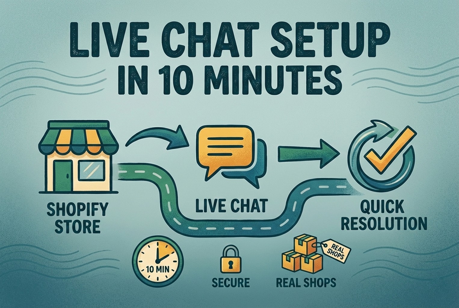
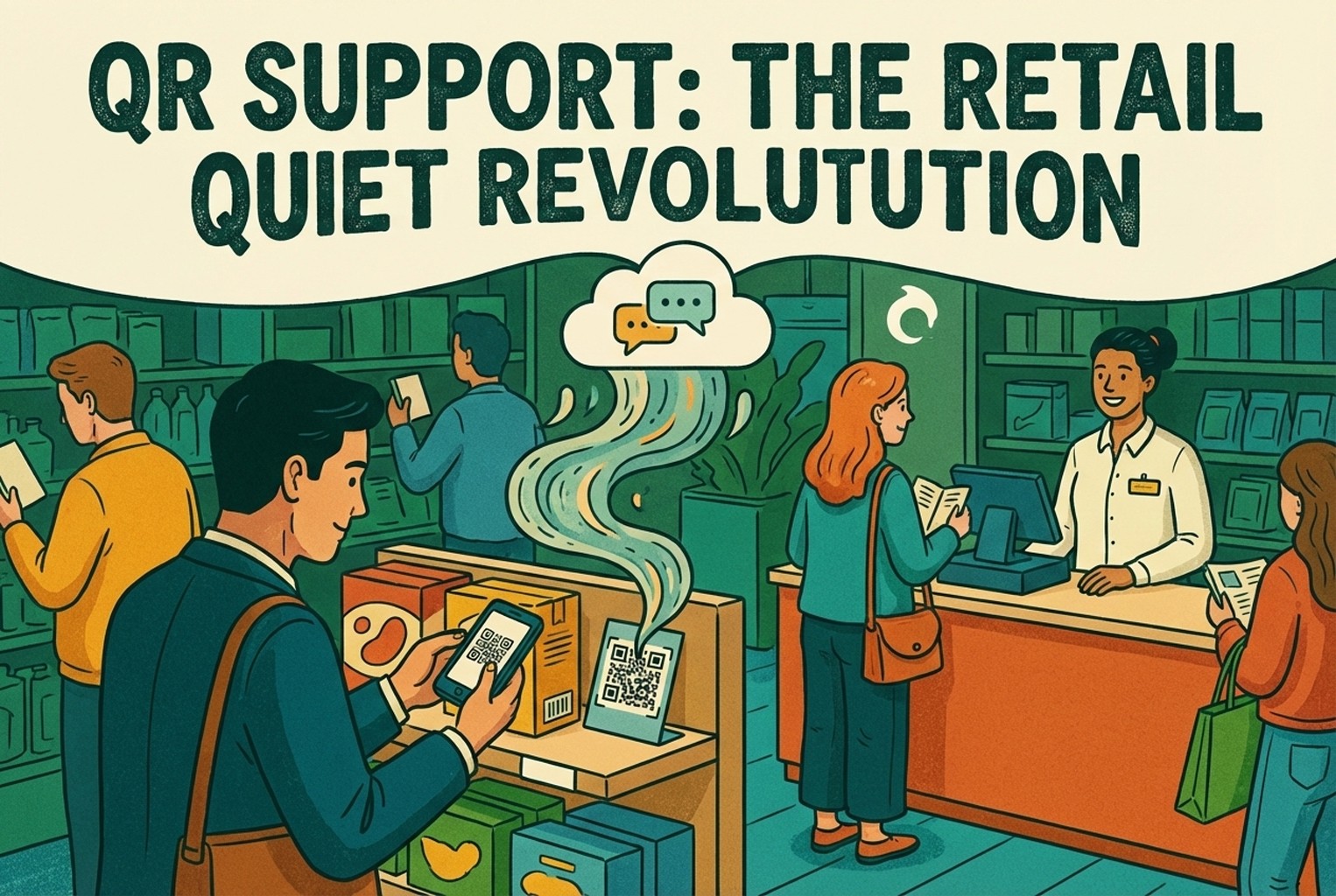
QR Support That Actually Works in Retail
What we saw when retail teams used QR codes for customer support rather than promos. Real placements, real screens, and how shops quietly reduced in-store questions and post-purchase messages without hiring more staff.


Share
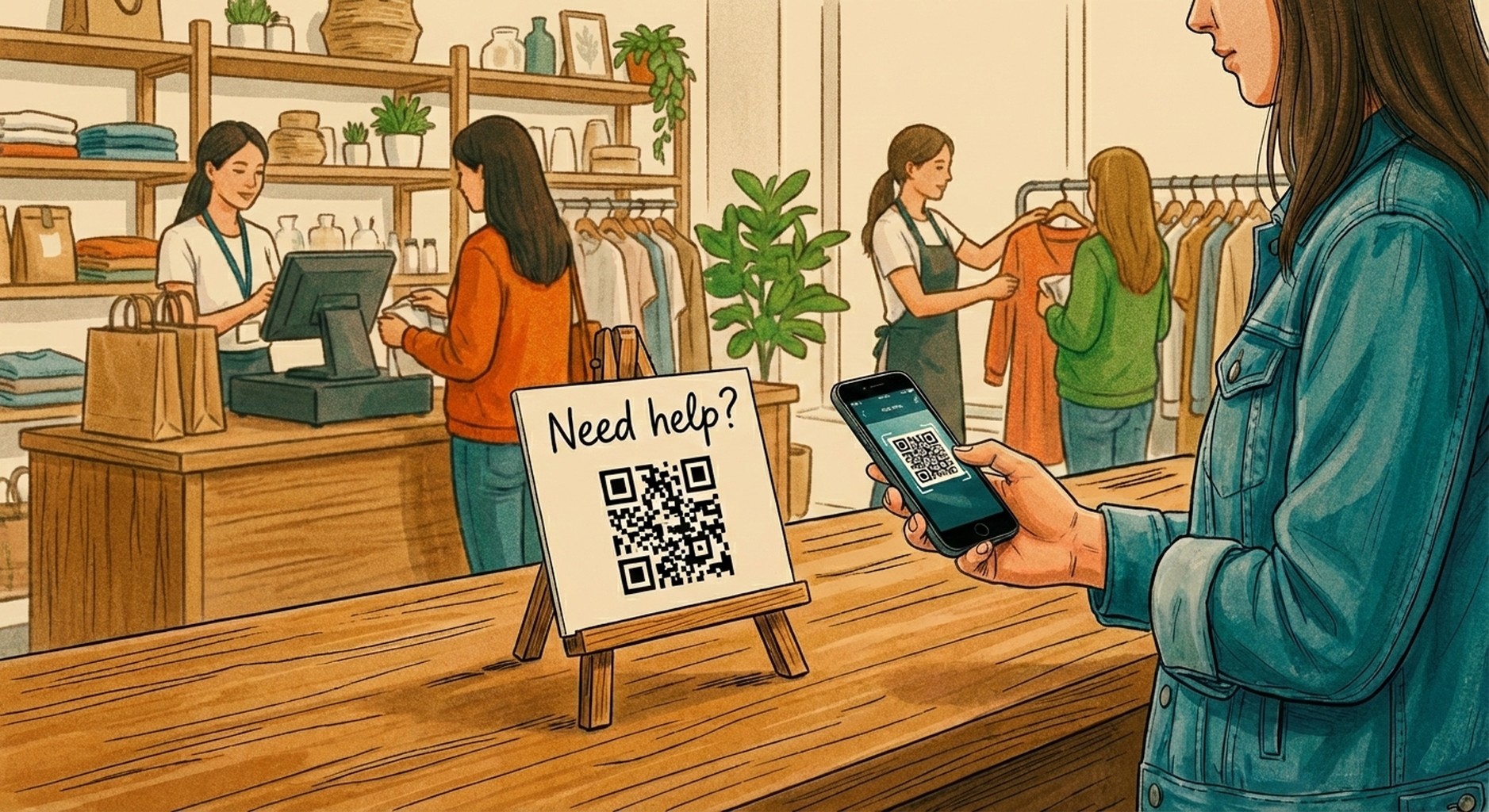
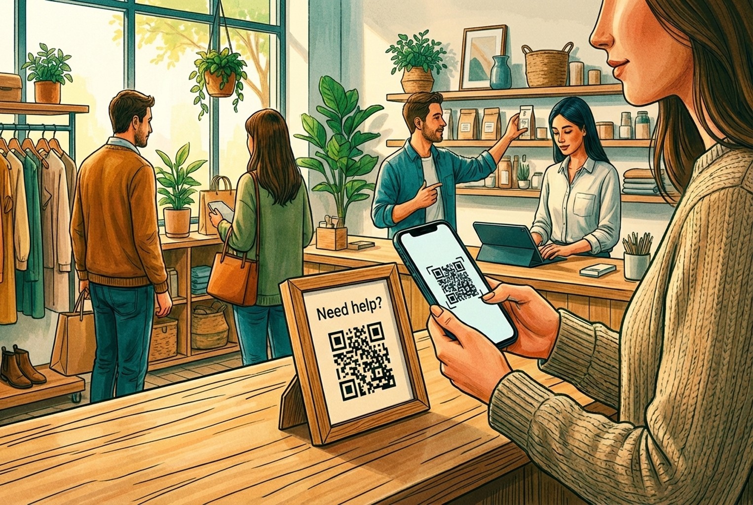
When a shop’s properly busy, the thing that grinds teams down isn’t footfall. It’s hearing the same two or three questions on loop. Someone asks at the till, another pings WhatsApp, then it pops up again in DMs and later lands in the inbox for good measure.
What we saw work wasn’t “more channels” or louder signage. It was using a support QR that led customers straight to the answer they were already hunting for. The shops that struggled were the ones sending scans to a homepage or generic page, which just made customers poke about and give up. The ones that got it right dropped people into a clear help screen and saved everyone a lot of faff.
QR support isn’t QR marketing
In a lot of shops we looked at, QR codes failed simply because they were treated like mini adverts. Scan this, see a campaign, have a browse. That works for promos, but it falls flat when someone just wants help and wants it quickly.
The difference with a proper support QR is intent. It doesn’t try to sell anything. It quietly points people to the next obvious step they were already looking for, whether that’s tracking an order, starting a return, checking how something’s meant to be set up, or getting through to a real person. When that flow is clear, customers tend to leave with a “cheers, sorted” feeling. When it isn’t, they default to messaging the shop instead.
We saw this pattern crop up often enough that it mirrors what’s covered in QR Code Customer Support: In-Store and Post-Purchase, especially around why generic landing pages quietly create more support work rather than less.
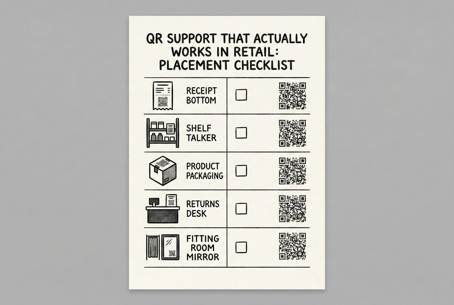
The QR placements customers actually bother scanning
Not every QR earns its keep. In the shops we looked at, the ones that got scanned were always sitting right at the moment of hesitation. A customer pauses, looks twice, then scans. Anything placed “just in case” usually got ignored. The placements below worked because they lined up neatly with real questions people were already asking out loud, which matches the broader pattern of how QR codes get used in retail settings when they’re tied to something practical rather than promo-led.
1. Shelf talkers for product questions
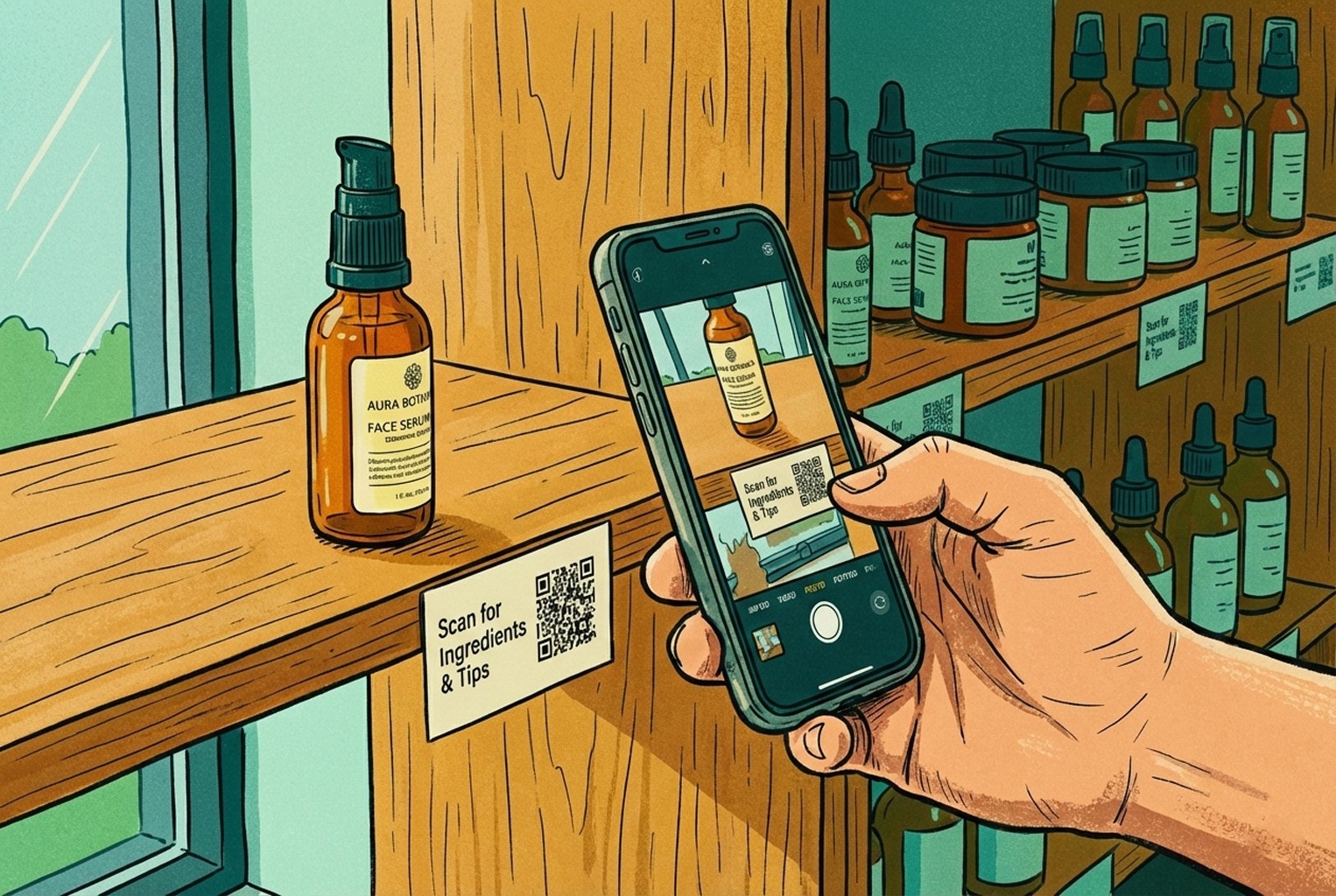
These showed up again and again as one of the quiet wins. Shelf-level QRs picked up the questions customers are slightly embarrassed to ask, or don’t want to queue for. They were most useful for things like “Will this work with what I’ve already got?”, “Is this safe for sensitive skin?” or “What size is this actually?”. The landing screens that performed best kept it simple: a handful of common questions, a short link to a fuller guide, and a clear option to ask for help if something still didn’t click.
In one beauty shop we saw, a small QR sat on the shelf edge next to a popular serum. Scanning it opened a page with how to apply it, patch test advice, and a clear ingredients list. Right at the bottom was a low-pressure “Still unsure?” button. Most people never tapped it, but knowing it was there stopped staff from getting pulled over for the same chat every ten minutes.
2. Receipt and footer: Returns, Tracking, and Contact
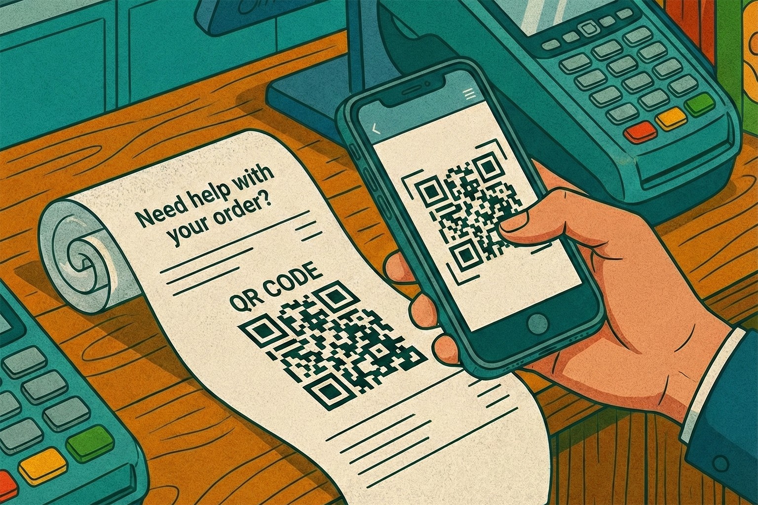
If there was one placement that quietly carried the most weight, this was it. Receipts and order footers caught almost every customer, and they caught them at the exact moment questions tend to pop up later on.
In a few of the better-run shops we saw, a simple line under the total did more work than a wall of signage ever could. Something along the lines of “Need help with your order? Scan here” sat neatly at the bottom and pointed to a single help screen. Because receipts already feel transactional, customers didn’t read this as marketing. They treated it as part of the purchase, which lines up with how QR codes tend to perform best in retail when they’re tied to practical follow-ups rather than promotions. What stood out was how low-drama this placement was. No explanations needed. No staff nudging people to scan. It just quietly reduced the number of “where’s my order?” and “how do I return this?” messages that usually land days later.
3. Packaging inserts for setup, care, and warranty
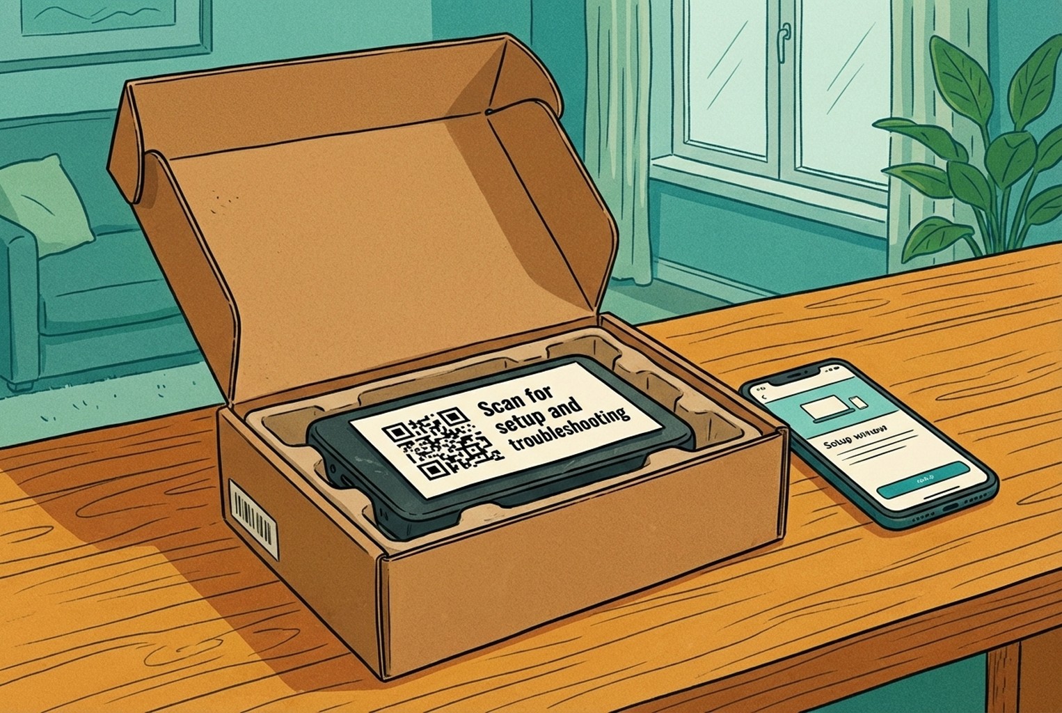
Packaging inserts only worked when they were impossible to miss. The moment teams tried to tuck them under foam or bury them at the bottom of the box, they might as well not have bothered. In a few electronics brands we looked at, the insert sat right on top of the product, usually as the very first thing someone touched after opening the box. One simple line did the job: “Scan for a 2-minute setup and quick fixes.” The QR led to a tidy screen with setup steps, common problems, warranty info, and a clear way to get in touch if things still weren’t behaving.
What made this effective wasn’t the QR itself, but the fact that it carried product context through. Instead of dumping customers into a generic help centre, the scan took them straight into SKU-level guidance, which is the same pattern we’ve seen work well in SKU-level QR codes on packaging support when teams want to head off support tickets before they even start.
4. Returns desks for policy checks and starting a return
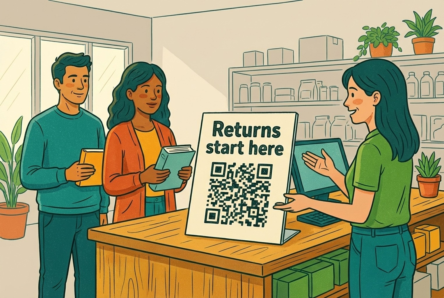
Returns desks tend to be where patience wears thin, on both sides of the counter. Customers already feel on edge, and staff are usually juggling a queue while answering the same policy questions again and again. In several shops we observed, a small QR placed right on the counter took the heat out of those moments. People waiting their turn would scan it and see the returns policy laid out plainly, along with a simple way to start the return process themselves. By the time they reached the front, most already knew where they stood. The human interaction didn’t disappear, but it became calmer and more focused, because the basics were already out of the way.
What worked here was the order of things. Self-serve first, human second. The QR didn’t replace the team; it just stopped the desk from becoming the place where every problem landed at once.
5. Pickup counters for order status and quick changes
Pickup counters tend to move fast until they don’t. One small question can stall the whole flow, especially when it turns into “Can I swap the colour?” or “Has my order actually arrived yet?”
In a few stores we looked at, a discreet QR by the counter helped keep things ticking over. Customers waiting to collect could scan it while they queued and check their order status or see what changes were still possible. By the time they reached the counter, most of the uncertainty had already been cleared up, which meant staff could focus on handover rather than explanations. What made this work was timing. The QR met customers in that awkward in-between moment where they had just enough time to scan, but not enough patience to wait for answers.
6. Fitting rooms and mirrors for size or colour requests
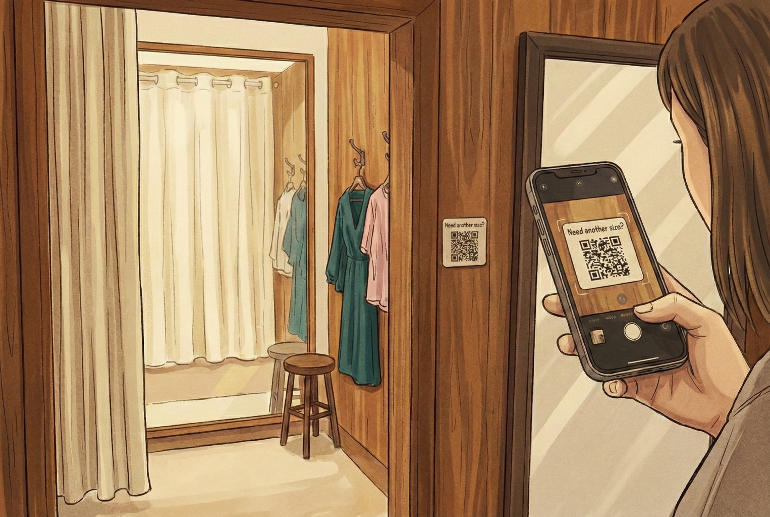
Fitting rooms are where customers hesitate, second-guess themselves, and often don’t want to shout for help. That awkward knock on the door or half-pulled curtain puts plenty of people off asking at all. In a few boutique clothing shops we saw, a small QR tucked inside the fitting room or on the mirror worked surprisingly well. The prompt was simple, something like “Need another size or colour? Scan here.” The scan opened a short screen asking for the item, size, and colour, then quietly passed that request to staff. No waving, no knocking, no pressure. Staff knew exactly what was needed, and customers felt looked after without the fuss.
What stood out was how natural it felt. The QR didn’t interrupt the experience. It just smoothed over one of the most awkward moments in-store.
7. Warranty cards or inside the lid for longer-term support
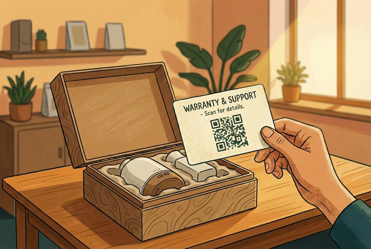
For higher-value items, support questions rarely stop at the till. They tend to crop up weeks or even months later, usually when the packaging has already been put away.
In a few stores selling more premium products, we noticed QR codes printed directly on the warranty card or inside the box lid doing a lot of quiet work. The wording stayed calm and reassuring, pointing people towards registration, basic troubleshooting, or spare parts rather than anything salesy. When customers scanned later on, they landed exactly where they needed to be without hunting through old emails or trying to remember where they bought the item.
This placement worked because it respected timing. It didn’t ask customers to act immediately. It just made support easy when it eventually mattered.
8. Staff lanyards or counter signs for last-resort help
Every now and then, a customer just can’t spot a member of staff. It’s not a service issue; it’s timing. Busy floor, short hands, wrong moment. In those cases, a small QR on a counter sign or staff lanyard acted as a quiet safety net.
What worked best here wasn’t dropping people straight into a blank chat box. That usually led to vague messages and more back-and-forth. The better setups sent scans to a simple menu first, letting customers choose what they actually needed help with before anything landed with the team. It kept expectations clear and stopped staff from opening messages with no context.
When teams stepped back and mapped these placements against the wider flow of how customers move through a shop, it became much easier to see where this kind of QR made sense. Linking placements back to Customer Touchpoints and the broader Customer Journey Map helped remove the guesswork and stopped QRs from being added “just in case”.
The QR destinations that actually cut support tickets!
Placements get people to scan. Destinations are what decide whether that scan reduces work or quietly creates more of it. In the shops that struggled, QR codes led to busy pages with too many options or, worse, nowhere obvious to go next. The ones that worked all had something in common. They gave customers a clear starting point and stopped messages from turning into long, rambling back-and-forth.
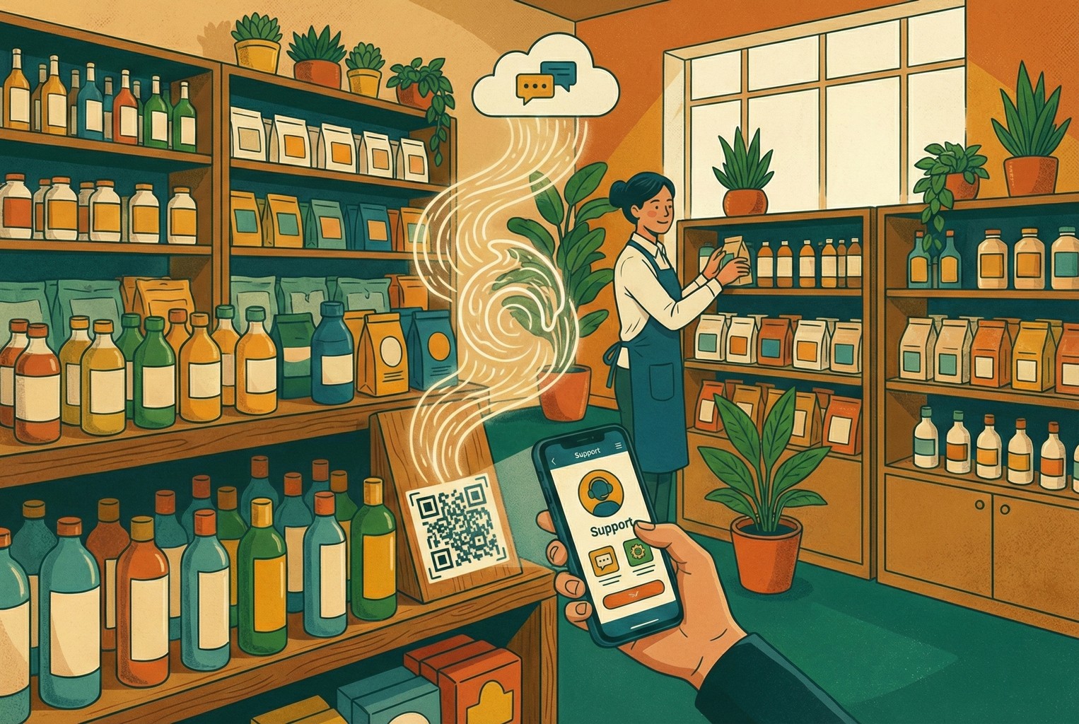
1. Post-purchase support hubs
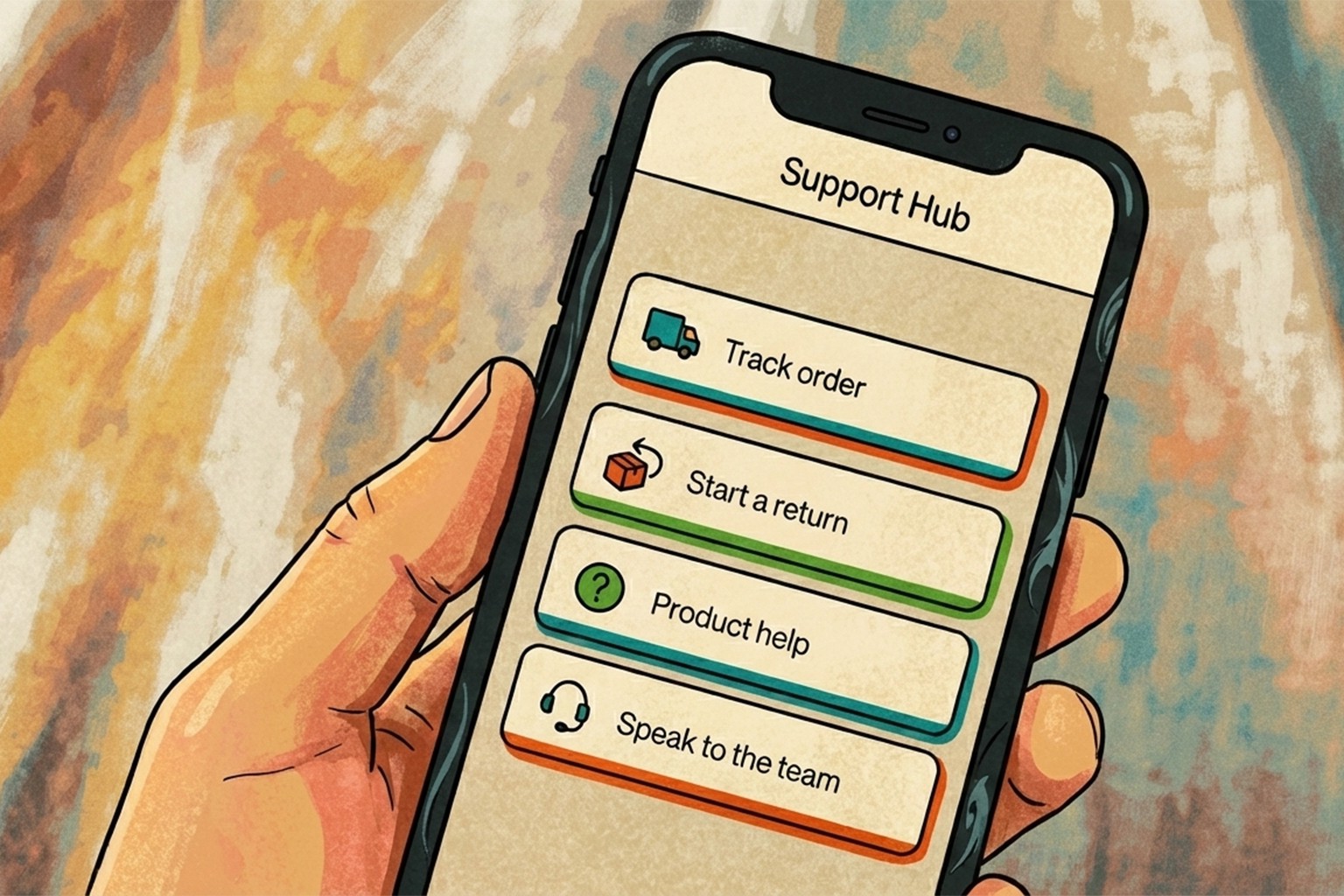
A simple support hub showed up again and again as the calmest option after checkout. Instead of customers typing out a whole story, they were nudged to pick what they actually needed first. The hubs that performed best weren’t clever. They were tidy. A short menu with options like tracking an order, starting a return, getting product help, or speaking to the team was usually enough to keep conversations focused. Customers landed, chose a path, and got on with it.
What made this effective was having a single entry point rather than scattering links across emails, receipts, and packaging. That approach mirrors the idea behind a lean setup, where fewer tools and clearer routes reduce loose ends, something that’s explored more fully in CX Platform Minimum Stack when teams want support to stay manageable as volumes grow.
2. Order status and tracking
Across a lot of retail teams we spoke to, tracking questions were rarely about impatience. Most of the time, customers just couldn’t find the link quickly enough, especially after the purchase confirmation email had been buried. When that happened, they defaulted to sending a message instead, even though the answer already existed somewhere. The setups that held up best made order status a single tap from the QR scan, often as the first thing customers saw after checkout. People landed straight on tracking rather than being pushed through logins or long help articles, which quietly reduced follow-up messages. This ties closely to what we’ve seen in broader post-purchase CX tools, where clarity and speed tend to matter far more than adding extra features.
3. Returns start and rules
Returns were one of the biggest sources of back-and-forth we saw, and it was rarely because customers were being difficult. Most of the time, the rules just weren’t clear or were scattered across different pages, emails, and receipts.
In the setups that worked better, the QR led to a returns page that laid things out plainly before anything else happened. Eligibility, timeframes, and what happens next were all on the screen, which stopped conversations looping around the same questions. Teams didn’t have to repeat themselves, and customers didn’t feel like they were guessing. A few merchants mentioned that once their wording was consistent in one place, return conversations became much shorter and calmer. That approach lines up closely with the kind of language patterns collected in Returns Templates & Macros, where clarity tends to do more heavy lifting than flexibility ever could.
4. Product troubleshooting and care guides
Long help docs look reassuring until someone actually needs them. In reality, the shops that saw fewer support messages were the ones linking QRs to short, visual guides that got straight to the point. We saw this work particularly well for products that needed a bit of care or setup. Instead of scrolling through a long article, customers landed on a handful of clear steps, a couple of images or short clips, and the most common fixes. When the information matched the product they were holding, people rarely needed to ask anything else. The fewer words on the page, the fewer messages landed in the inbox later.
How do teams set this up on their e-commerce platform?
The mechanics mattered less than people expected. What made the difference wasn’t the platform itself, but whether teams could change where a QR sent customers without having to reprint half the shop.
In shops running on Shopify, some teams used Shopcodes to generate QR codes tied to specific products or actions, then quietly updated the destination as their support flows evolved. That flexibility turned out to be more important than the initial setup. For teams on other platforms, the pattern was much the same. Any QR generator did the job as long as it allowed destination control. The shops that struggled were the ones that hard-linked QRs to fixed pages, only to realise later that the page needed changing. The ones that fared better treated QR destinations as living pages, not something set in stone once printed.
Tracking scans and what happens next?
Once QR codes were live, the teams that learned the most weren’t staring at dashboards all day. They were just keeping an eye on two simple signals. One was how often each QR actually got scanned. The other was what people chose after landing, whether they tapped tracking, started a return, or asked to speak to someone.
In a few cases, that small bit of visibility was enough to spot patterns quickly. Some placements barely got used and were quietly removed. Others turned out to be doing far more heavy lifting than expected. Over time, this helped teams decide where light automation made sense and where it didn’t, which echoes the thinking behind customer service automation that doesn’t create a mess, even for shops that aren’t using Shopify at all.
Why QR is starting to matter more over the next couple of years?
In the past, QR codes felt optional. Handy in some places, ignored in others. That’s starting to change. Across a few retail teams we spoke to, scanning behaviour was already creeping up, partly because people are simply more used to pulling their phones out without thinking twice.
At the same time, there’s a wider shift happening towards 2D barcodes that can carry more information and sit alongside traditional barcodes at the till. This transition, often referred to as Sunrise 2027, is nudging retailers to rethink what those scans are actually for, beyond price checks or promotions.
What this meant in practice for the merchants we saw was simple. Customers were already scanning. The shops that had their support flows ready benefited quietly, while others realised too late that their QR codes led nowhere useful. Getting the support side right early gave those teams a head start without having to change much else at all.
Common mistakes we kept running into!
A few issues cropped up so often that they became familiar. The most common was sending the QR to the homepage. It sounds harmless, but in practice, it just leaves customers poking about, getting fed up, and messaging anyway.
Another regular was the “everything page”. One long wall of text trying to answer every possible question at once. People didn’t read it. They skimmed, got lost, and gave up. The setups that worked nearly always had three or four clear options instead.
We also saw plenty of “chat to us” buttons added without any thought to timing or staffing. All that did was move the queue from the counter to the inbox. Different policies living in different places caused their own problems too. Slight wording changes around refunds or exchanges led to unnecessary back-and-forth and the odd heated conversation.
And finally, there were QRs that just sat there doing nothing because no one was checking whether they were being scanned at all. Those signs kept getting reprinted, moved around, and redesigned, without anyone stopping to ask if customers were actually using them.
Copy and paste kit: Placements that held up in practice
Once teams stopped debating theory and wrote things down plainly, this kind of simple planner made it much easier to stay consistent. The versions that got used were short, printable, and easy to glance at during a shift.
Printable QR support placement planner:
Receipt or footer:
Support hub covering tracking, returns, and the most common questionsShelf talker:
Product FAQs with a quiet “Ask a question” option if something still isn’t clearPackaging insert:
Set up steps, basic troubleshooting, and warranty information in one placeReturns desk:
Clear return rules with a straightforward way to start the processFitting room:
Quick request for another size or colour without leaving the room
What worked about this setup was that nothing overlapped unnecessarily. Each QR had a job, and customers quickly learned what they were likely to get when they scanned one. That clarity did more to reduce noise than adding extra signs or longer explanations ever did.
Sign copy that didn’t feel salesy!
Receipt or counter sign
“Need help with your order? Scan for tracking, returns, or quick answers.”Packaging insert or product card
“Scan for setup and common fixes. If it’s still not playing ball, you can message us here.”Returns desk sign
“Returns start here. You’ll see eligibility, steps, and timing all in one place.”
These worked because they didn’t over-explain or promise too much. They simply told customers what would happen next, which made scanning feel like the easiest option rather than another chore.
Returns page starter copy
“Start your return below. If your item is eligible, you’ll see the next steps straight away. Refund timing depends on inspection and how your payment was made.”
This kind of wording held up well because it set expectations without sounding defensive. Customers knew what was happening, and teams didn’t have to keep re-explaining the same points in different ways.
Frequently asked questions we kept hearing:
Can QR codes really reduce support messages, or do they just move them around?
They can reduce them, but only when the QR leads somewhere useful. In the shops where scans dropped customers into a clear support hub instead of a generic page, message volume genuinely fell. This lined up with what we saw across different customer touchpoints, where clarity at the right moment mattered more than adding more channels.
What’s the biggest mistake retailers make with QR support?
Sending scans to the homepage came up again and again. Customers scanned with a specific question in mind, then had to hunt for answers. That friction usually pushed them straight into messaging instead. Teams that mapped QR placements against their customer journey tended to avoid this and saw better results.
Do customers actually want to scan QR codes in-store?
Most don’t think about it consciously anymore. Scanning has become second nature, especially when it solves an immediate problem. We saw this shift accelerate as QR use became more practical rather than promotional, which mirrors wider changes in retail behaviour discussed in customer experience trends more broadly.
Should QR codes point to chat straight away?
Not usually. The calmer setups sent customers to a menu first, then into chat only if needed. That reduced vague messages and helped teams respond faster. This approach also reflects the difference between customer service and customer experience that’s explored in Customer Service vs Customer Experience, where structure often beats speed alone.
How do returns QR codes actually help?
Returns got easier when policies and next steps lived in one place. Customers stopped guessing, and conversations became shorter. Teams that standardised wording saw fewer arguments and less back-and-forth, which is why return flows featured so heavily in returns templates and macros used by smaller teams trying to stay consistent.
Is this only useful for e-commerce-heavy retailers?
Not at all. Physical shops with pop-ups, concessions, or wholesale shelves often saw just as much benefit, especially post-purchase. QR support helped bridge the gap between in-store and aftercare, something that comes up repeatedly in discussions around customer experience management rather than channel-specific tooling.
Why does reducing effort matter more than “delighting” customers?
Because most customers aren’t looking to be impressed. They just want things to work. That idea is backed up neatly in Stop Trying to Delight Your Customers, and it echoed what we saw on the ground. When the next step was obvious, people stopped chasing staff for answers.
How do teams know if their QR setup is working?
The shops that learned fastest tracked very little. They looked at how often QRs were scanned and what people chose next. Over time, that made it easier to decide where automation helped and where it didn’t, a pattern that also shows up in CX metrics vs KPIs when teams try to avoid over-measuring the wrong things.
Where does AskDolphin fit? Without the faff
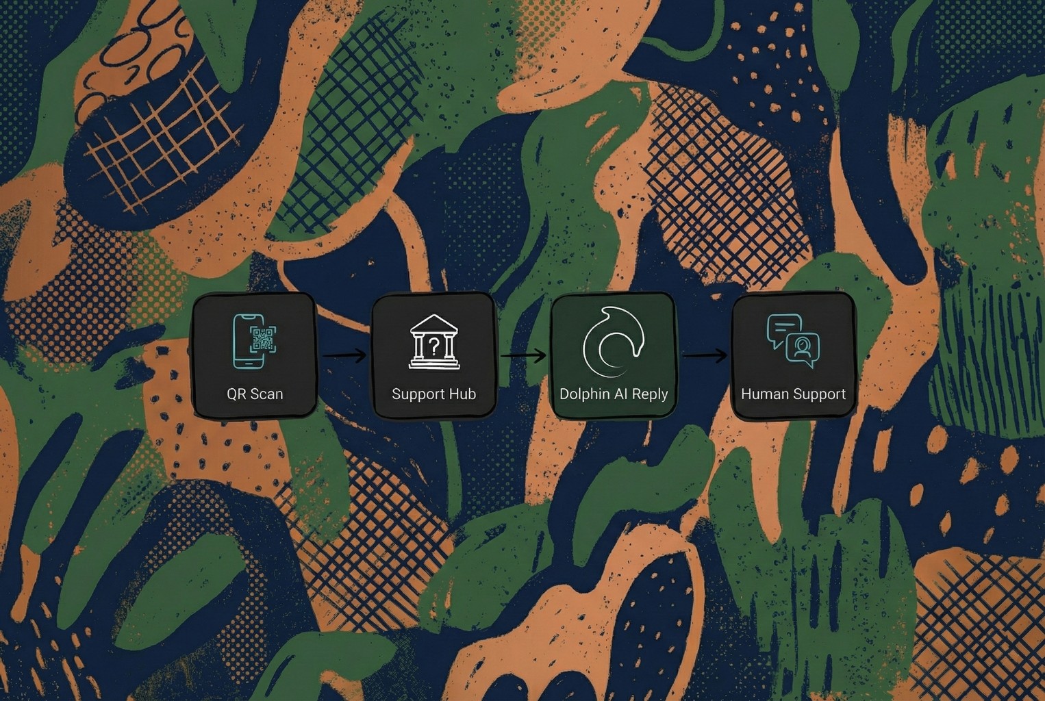
In the setups that held up best, QR codes weren’t treated like static web links. They became proper support entry points. When a scan led somewhere that could handle context, route messages, and keep conversations tidy, teams felt the difference almost straight away.
That’s where AskDolphin QR Code Customer Support tended to slot in naturally. Scans turned into structured chats rather than loose messages, everything landed in one shared inbox, and Dolphin AI helped with fast first replies while still handing things over to a human when judgement was needed. It didn’t replace the team. It just stopped them having to start from scratch every single time.
Most merchants we spoke to weren’t chasing more tools. They wanted fewer repeat questions and less noise. A single QR on the receipt or order footer that led to a simple support hub was usually the first step that proved whether the approach would stick, then everything else became easier to tidy up around it.
There’s a useful bit of thinking on this in Stop Trying to Delight Your Customers, which basically backs up what we kept seeing in the wild. Customers don’t need fireworks. They need less effort. When the next step is obvious, people stop pestering you for it.
If you want the bigger joined-up view of how this connects across store and post-purchase, Omnichannel CX for small teams (2026) pulls the same thread through with a practical lens.
And if what you actually need is a QR-led support hub with one inbox and AI assistance that still hands over to a human when it matters, you can set it up here in your own time: https://app.askdolphin.com/auth/sign-up
No hard sell. Just the thing you were looking for, if you want it.

About author