Post-Purchase CX Tools That Cut Support Tickets
Post-purchase support is where most customer tickets pile up: order tracking, delivery delays, returns, and refund follow-ups. This practical playbook breaks down the simplest customer experience tools small retail teams can use to deflect tickets, set expectations clearly, and keep post-purchase support under control without hiring more staff.


Share
Post-purchase support is where otherwise decent days tend to go sideways.
Across a lot of small retail teams we’ve spoken to, the pattern’s the same. Orders go out on time, stock’s fine, marketing’s ticking along, then the inbox lights up. “Where’s my order?” starts rolling in. Someone wants to change an address after dispatch. Another customer’s asking why their refund hasn’t landed yet. None of it is dramatic on its own, but stack it up and suddenly half the day’s gone before lunch.
For tiny teams especially, post-purchase doesn’t just add work; it quietly becomes the work.
Why post-purchase is where support volume explodes
Most customers are not getting in touch for a natter. They reach out because they feel stuck and don’t know what happens next. What we’ve seen time and again is that marketing does its bit just fine. The order goes through, payment clears, and then the customer's mindset flips. The experience quickly boils down to two blunt questions. Where’s my order, and what happens if something’s wrong? That’s usually where loyalty gets tested, often in a couple of short messages that decide whether the customer comes back or not.
When you step back and look at this through a wider customer touchpoints lens, post-purchase stands out as one of the heaviest moments in the whole journey. It shows up clearly again when mapping the full flow in a customer journey map. This stage carries more anxiety, more uncertainty, and more incoming questions than most teams expect, which is why it quietly drives such a big chunk of support volume.
The 5 post-purchase moments that trigger tickets!
In most of the teams we’ve worked with, the first spike happens almost immediately after checkout. Someone places an order, closes the tab, and a few minutes later, the doubt creeps in. Did it actually go through? Was the payment taken? Did I mess something up? That uncertainty alone is enough to trigger a quick support message.
A few days later, it’s usually the tracking link that causes the next wave. When tracking sits still or updates slowly, customers assume something’s wrong. Even when nothing is, that quiet gap between dispatch and delivery tends to generate more “just checking in” messages than any technical issue ever does.
Then come the proper problems. Parcels arrive late, turn up damaged, go missing, or land on the doorstep containing the wrong item. These are the tickets that feel urgent on both sides and often land with a bit of frustration baked in.
Returns are another flashpoint. Not because customers mind returning things, but because they don’t want to hunt around for how to do it. When the process isn’t obvious, the quickest path becomes sending a message and waiting for a reply.
And finally, there’s the classic. The refund has been issued, but hasn’t appeared yet. From the merchant side, it’s done and dusted. From the customer side, the money still isn’t in their account, so the question pops up again. Where’s my refund?
The post-purchase CX tool stack: Simple and not bloated
One thing that comes up again and again when talking to small retail teams is tool fatigue. Somewhere along the way, post-purchase support picked up too many apps, too many workflows, and far too many half-used features. The irony is that the calmest inboxes usually belong to teams running a much simpler setup. The stacks that held up best all did three quiet jobs well. They answered the obvious questions quickly, without a human getting involved every time. They collected the right information upfront, so staff were not playing email ping-pong. And when something genuinely went wrong, they handed the conversation to a real person with enough context to fix it without starting from scratch.
What stood out is that none of these teams were chasing a perfect system. They were aiming for a minimum that actually worked. That thinking lines up closely with what we outlined in CX Platform Minimum Stack for Small Teams, where fewer tools, wired together properly, beat a bloated setup every single time.
1) Order status page as the front door
In the cleaner setups we’ve seen, the order status page quietly did most of the heavy lifting. Not as a receipt or a tracking-only screen, but as the place customers naturally ended up when they had a question after buying.
On platforms like Shopify and similar e-commerce systems, the order status page already shows delivery progress and is linked from confirmation and shipping emails. A few merchants took it one step further by treating it as a proper post-purchase hub, adding just enough information to stop customers panicking and firing off messages when something felt unclear. That approach lines up neatly with how post-purchase tools fit into a broader customer experience tools setup, where the aim is clarity before contact.
What worked best was keeping things painfully obvious. One large tracking button that was hard to miss. A short note explaining when address changes were still possible and when they were not. A clear way to start a return without having to ask for help first. A simple problem-report option for damaged, missing, or incorrect items. And finally, a contact option that was visible but clearly not the first step. In contrast, whenever the order status page was left bare, the pattern was predictable. Customers did what customers always do when they cannot see the next step. They opened chat, sent an email, or replied to an old notification. Often more than once. The inbox paid the price for what was missing on that one page.
2) Proactive updates: What to send, and when?
The teams with the quietest inboxes were not the ones sending more messages. They were the ones sending the right ones at the right moments.
What we noticed is that confirmation emails, shipping confirmations, and delivery updates were doing more than just passing on information. When those messages included a clear link back to the order status page, customers had a place to orient themselves instead of replying straight to the email or opening chat. That single link quietly absorbed a surprising amount of follow-up, especially when paired with a short explanation of what happens next. It fits neatly into a broader post-purchase customer experience approach where reassurance matters more than volume.
Timing mattered more than polish. A confirmation message that explained typical dispatch times reduced early “did it go through” messages. A dispatch update that included tracking, plus a plain-English note about why tracking might not update immediately, took the edge off the anxious check-ins a day or two later. And delivery notifications that explained what to do if a parcel was marked delivered but not actually in hand stopped a lot of repeat messages before they started.
What stood out was restraint. These merchants were not blasting customers with updates. They were nudging them gently at moments when uncertainty usually spikes. That kind of proactive communication sits right at the heart of a solid customer experience strategy, where fewer messages can still do more of the work.
3) Returns entry and rules (reducing the back and forth)
Returns only turn into a headache when customers are left guessing. In the smoother setups we came across, the issue was rarely the return itself. It was the uncertainty around how to start and what would happen next. What made the biggest difference was clarity around return rules. Eligibility, fees, and timelines were defined upfront, and the return flow followed those rules consistently. Where teams introduced self-serve returns, they found it reduced a lot of early messages because customers could move things along themselves instead of waiting for a reply. That said, a few merchants learned the hard way that self-serve has limits. Exchanges were still a manual step, and some customers needed newer account access before the option even appeared, which meant edge cases still landed in the inbox. The cleanest implementations all shared one thing in common. There was a single, obvious entry point into returns, usually linked from the order status page, that collected everything in one go. Customers selected the reason, confirmed the condition, added photos only when something looked genuinely wrong, and chose their preferred outcome if alternatives like credit were available. That upfront detail stopped long email chains before they started.
Teams that struggled tended to skip the policy side. The calmer ones had a plain-English return and refund policy published and easy to find, often built using simple policy templates and then mirrored in their replies. We saw this work particularly well when paired with consistent wording pulled straight into saved responses, similar to the approach outlined in returns templates and macros, where policy and communication stayed in sync. Once returns were framed as a clear process rather than a conversation, support volume dropped noticeably. Customers knew where they stood, and staff were no longer re-explaining the same rules on repeat.
4) Refund expectations! Stopping the “Where’s my refund?” follow-ups
Refund conversations only spiral when expectations are left fuzzy. One pattern we kept seeing was this small but costly mismatch in language. A merchant says the refund has been processed. The customer hears that the money should already be back in their account.
In reality, there is usually a gap. When refunds are issued through standard payment rails, it can take up to ten business days for the funds to show up, purely because of bank processing times. That detail tends to get lost unless it is spelled out clearly, and when it is not, customers quite reasonably come back asking what’s going on. Another thing that caught a few teams out was the order of operations. Once a refund is issued, you cannot always create a return afterwards. That sounds obvious in hindsight, but in busy inboxes it led to awkward follow-ups where customers were half way through one flow and suddenly told they were on another. The teams that avoided this had their refund language and workflows aligned from the start, which saved a lot of backtracking later.
The refund messages that worked best were boring in the best possible way. They stated the exact date the refund was issued, explained the realistic bank window in plain terms, and told the customer what to do if the money still had not arrived after that point. No waffle, no vague promises. We saw this approach reinforced when merchants reused consistent wording across replies, similar to how refund communication templates help keep expectations steady across the whole team. Once refund timing was framed properly, the follow-up messages dropped off sharply. Not because refunds were faster, but because customers finally understood what “processed” actually meant.
5) Exception handling
What surprised a few teams when we looked closely at their inboxes was how predictable exceptions actually were. They felt chaotic in the moment, but when you lined them up, the same situations kept cropping up again and again. Most fell into three buckets. Parcels where tracking had stalled and nobody quite knew if they were moving or not. Orders marked as delivered that the customer swore had not arrived. And items that turned up damaged or simply wrong. Different products, different carriers, same handful of scenarios.
The merchants who coped best did not treat these as one-off fires to put out. They had loose but consistent flows for each category. When a parcel was delayed, the first reply explained what normally happens next and when it would be escalated. When something was marked delivered but missing, the response asked for a quick check of safe places or neighbours before going further. And when an item arrived damaged or incorrect, the message focused on gathering what was actually needed, usually a photo and an order reference, rather than dragging things out over multiple emails.
What made those conversations feel calmer on both sides was clarity around next steps. Customers knew whether a replacement, refund, or carrier claim was coming, and roughly how long it would take. Support teams were not reinventing the wheel each time. This approach also tied neatly into broader customer experience management thinking, where handling the messy moments well matters just as much as the smooth ones. Once these exception flows were written down and reused, they stopped feeling exceptional at all. They became just another part of the post-purchase experience that the team could handle without everything grinding to a halt.
What this looked like in real shops!
Once we stepped away from theory and looked at how small teams were actually handling post-purchase support day to day, a few patterns kept cropping up. The setups that worked were rarely clever. They were practical, a bit scrappy, and designed around cutting out unnecessary back-and-forth rather than trying to impress anyone.
Below are a few real-world examples of how different retail teams simplified post-purchase support and quietly took pressure off their inboxes.
A - Boutique clothing: Size swaps without the email tennis
One small fashion brand we worked with had a familiar problem! Size swaps were easy in theory, but in practice, they turned into long email chains. Customers asked how to swap, staff asked which size, then checked stock, then asked for address confirmation. Back and forth, back and forth.
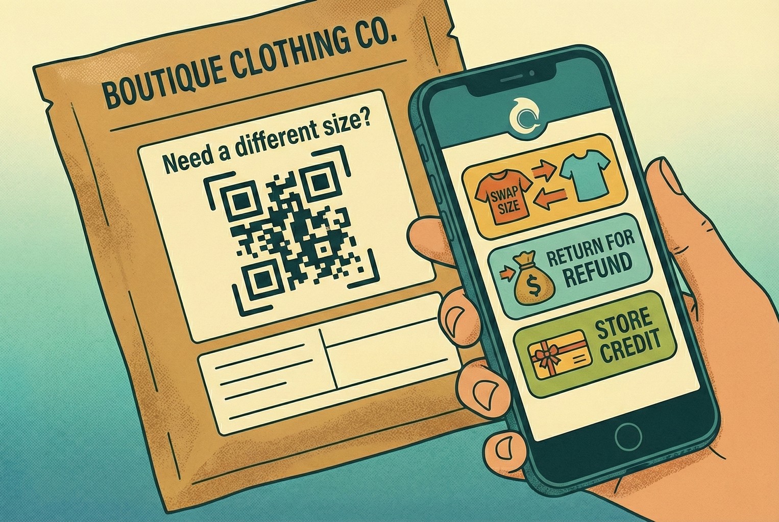
What finally settled things was a simple QR printed on the packing slip, tucked under a line that said “Need a different size?”. When customers scanned it, they landed on a first screen that gave them three clear options. Swap for another size, return for a refund, or take store credit. No hunting around, no guessing what was allowed. From the team’s side, the follow-up was refreshingly dull. They approved the exchange, confirmed the address, and sent out the replacement in a single reply. Most of those conversations were wrapped up without a second message.
They later refined the setup by linking scans to the exact product the customer had ordered, using SKU-level QR codes so the help flow already knew which item and variant was involved. That small tweak cut even more back-and-forth out of the process and stopped size swaps from clogging the inbox during busy weeks.
B - Electronics accessories: Fault or Setup mix-up?
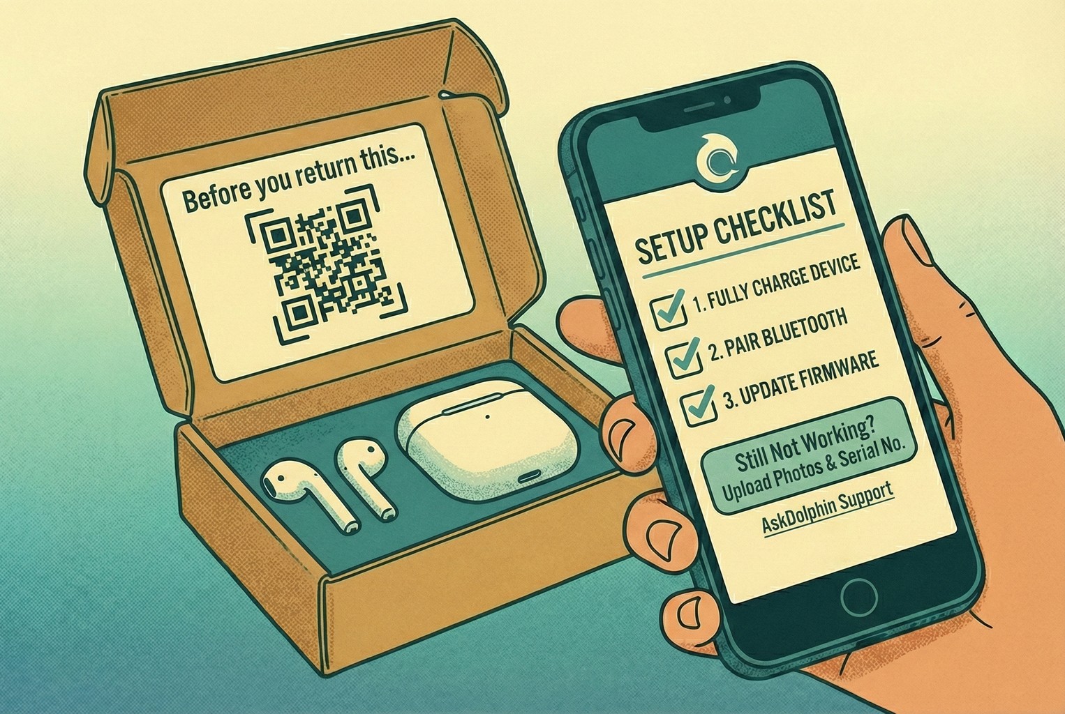
Another pattern we saw a lot came from electronics and accessories. Customers would hit a problem, assume the product was faulty, and head straight for a return. In reality, a fair chunk of those issues turned out to be simple setup confusion. One team tackled this by placing a small QR inside the box lid with a line that read “Before you return this…”. When scanned, customers landed on a quick checklist that covered the most common setup mistakes. If that didn’t sort it, the screen prompted them to upload two photos and enter the serial number.
From the support side, the difference was immediate. Genuine faults moved straight into a replacement or refund flow without any detective work. Setup issues were handled by sending the exact guide for that product, which solved most cases in a single reply. It stopped good stock from being sent back for no reason and kept the tone friendly rather than defensive.
C - Beauty products: Damage claims without the awkward back and forth!
Beauty brands had a different problem, mostly around damaged items and the grey area of what could be returned once opened. In the setups that worked best, this was handled early and cleanly.
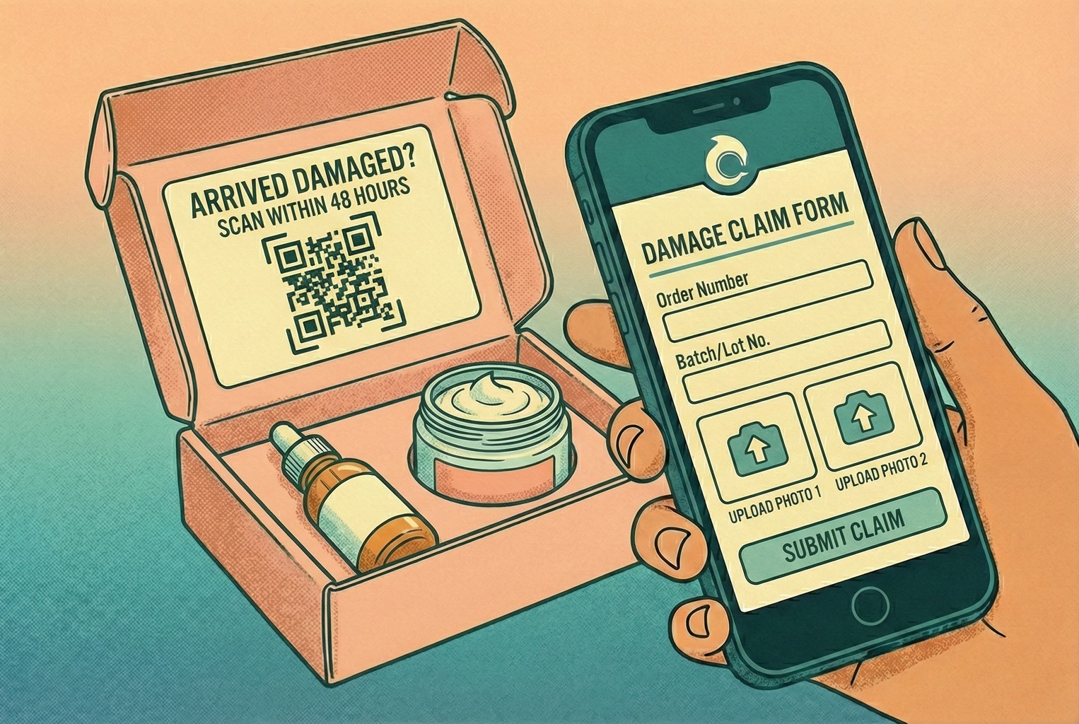
One brand added a simple insert card to every order, saying “Arrived damaged? Scan within 48 hours.” The QR led to a short damage form that asked for a couple of photos, the order number, and the batch or lot number. Customers knew exactly what was expected, and staff got everything they needed in one go. Because the information came in upfront, replacements could be approved quickly without long email chains. Policies around opened or used items stayed consistent, and customers felt the process was fai,r even when a refund was not possible.
Both of these examples sat within a wider approach to support that covered the shop floor and the post-purchase moment together. Merchants who joined the dots between in-store scans and post-purchase help flows saw the biggest drop in repeat tickets, especially when using QR code customer support alongside QR code customer support with AI to route issues cleanly without losing context.
Common mistakes we kept running into
A few issues cropped up so often they were hard to ignore. None of them were dramatic on their own, but together they quietly undid a lot of otherwise solid setups.
The first was QR codes that dumped customers on the homepage. Every time that happened, the scan created more work instead of less. Customers had to hunt for the right page, give up halfway through, and message support anyway. It defeated the whole point of having the QR in the first place, especially when the rest of the post-purchase flow had been thoughtfully mapped out in a customer journey map.
Refund language caused just as much grief. We saw plenty of messages saying a refund had been “processed”, without explaining what that actually meant. From the customer’s point of view, processed sounds like finished. When the money did not appear straight away, follow-up tickets landed fast. Teams that spelled out realistic bank timelines avoided this confusion entirely, which lined up neatly with how refund communication was handled in returns and refund templates.
Another common trap was forcing returns to start over email or live chat. That single decision turned simple requests into long conversations. Each return became a ticket generator, especially during busy periods when replies were slower and customers chased updates.
We also noticed problems when saved replies drifted away from the actual policy. One agent would promise one thing, another would say something slightly different, and suddenly, support was untangling a mess of “but your colleague said…” messages. Teams that kept macros aligned with their real rules avoided this entirely, particularly when they treated macros as part of their wider customer service automation setup rather than one-off shortcuts.
And finally, measurement was often too shallow. Ticket volume on its own told very little. The teams that improved fastest were looking at why tickets came in and how long they took to resolve, not just how many there were. That way of thinking mirrors the difference between raw numbers and meaningful insight laid out in CX metrics vs CX KPIs and backed up by more practical customer experience metrics.
How did teams actually roll this out?
Step 1: Making self-serve the obvious starting point
In the setups that reduced ticket volume fastest, customers were gently funnelled towards self-serve before they ever reached a human. Not through dark patterns or hidden links, but by making the right entry points hard to miss.
Most started with the order status page. A few clear buttons were enough. Tracking, returns, reporting a problem, and a visible contact option for when nothing else fits. Once those paths were in place, a lot of low-effort messages never arrived in the first place.
Returns were handled in a similar spirit. Instead of asking customers to explain the situation in free text, the return request form collected the basics upfront. Reason for return, condition of the item, and photos only when something looked genuinely wrong. That approach mirrored how self-serve returns are meant to work and saved teams from chasing missing details later on.
Several merchants also added a small packaging insert with a QR that pointed to a post-purchase help hub. For more complex catalogues, the QR is sometimes linked to SKU-specific help so customers land in the right place straight away. We saw this work particularly well when paired with SKU-level QR support on packaging, which removed yet another round of clarification from the conversation.
Step 2: Getting macros consistent for WISMO, returns, and refunds
Once self-serve entry points were in place, the next thing that separated calm teams from chaotic ones was how they handled replies. Not automation for the sake of it, but consistency. The replies that worked best were rarely clever. They were short enough to read quickly, specific enough to answer the question properly, and written in a way that lined up exactly with the store’s policies. Most importantly, they avoided over-promising. That last bit mattered more than teams expected.
WISMO replies are a good example. When tracking updates lag, customers want reassurance more than detail. Teams that used a single, repeatable message explaining where to check tracking and when it would be escalated avoided a lot of follow-ups. This worked especially well when the language matched what customers already saw on the order status page, which is how platforms like Shopify expect post-purchase updates to function in the first place.
The same applied to returns and refunds. Merchants who mirrored their saved replies to how returns and refunds actually behave in the platform avoided confusion. For example, refund replies that clearly explained bank processing times reduced repeat messages, something that aligns with how refunds are handled at a system level rather than an instant action. When macros reflected that reality, customers trusted the answer and waited. A few teams centralised all of this into one inbox, so staff were not jumping between tools. That is where setups like AskDolphin live chat came into play, combining live chat, AI-assisted first replies, and QR-driven entry points in one place. What mattered was not the tech itself, but the fact that macros stayed consistent no matter where the conversation started.
The teams that struggled tended to treat macros as shortcuts rather than shared language. The ones that got it right treated them as an extension of their policies, much like the approach laid out in returns templates and macros, where wording is designed once and reused everywhere. When replies stopped changing depending on who answered the ticket, support conversations became predictable again. That predictability turned out to be one of the biggest stress reducers for both customers and staff.
Step 3: Measure: ticket reasons + time to resolution
Track weekly:
Top 10 reasons (WISMO, return start, refund status, delivery exception)
Median time to resolution
% solved in one touch
% deflected to self-serve
Then fix the top one. Don’t overthink it.
Step 3: Measure what keeps causing noise
Once things were live, the teams that stayed sane checked the same few numbers each week. They grouped tickets by reason. WISMO, return starts, refund status, and delivery issues. Seeing those patterns clearly is why tracking customer experience metrics matters more than raw ticket volume. They also watched how long tickets actually took to close. When the median resolution time dragged, follow-ups piled in. That’s why resolution time is commonly treated as a core support signal, as it reflects how smooth the experience feels once someone asks for help. Another quick check was how often issues were solved in one reply. Clear answers meant fewer back-and-forth messages, which lines up with the idea behind first-contact resolution used widely in support teams.
Finally, they kept an eye on how many questions never reached a human because customers sorted themselves out through tracking pages or return flows. When that number went up, the inbox calmed down. Then they fixed the biggest problem on the list and moved on. No overthinking.
Templates library: Post-Purchase Ticket Deflection Kit
These are the replies we kept seeing work best across small retail teams. They’re predictable, calm, and do not over-promise. Most importantly, they set expectations clearly so customers don’t feel the need to chase.
1) WISMO / tracking link
Hi {name}, quick one.
You can track your parcel here: {tracking_link}.
If it hasn’t updated by {date}, reply with your order number and we’ll take a proper look.
2) Tracking hasn’t moved
Totally fair to check.
Tracking can sit for {time_window} between scans.
If there’s still no movement by {date}, we’ll escalate it with the carrier.
3) Address change (before dispatch)
If it hasn’t dispatched yet, we can update the address.
Send the correct address and postcode and we’ll confirm once it’s changed.
4) Delivered but not received
Sometimes parcels get marked as delivered a bit early.
Please check safe places or neighbours first.
If it’s still missing after {hours}, reply with “MISSING” and we’ll start a trace.
5) Shipping delay apology (without over-promising)
Quick update on your order.
It’s delayed due to {reason_if_known}.
The new estimate is {date_range}. If that doesn’t work for you, let us know and we’ll sort an option.
6) Returns start (self-serve)
You can start your return here: {returns_link}.
Choose the reason and you’ll see the next steps straight away.
7) Return approved
Approved, thanks for sending that over.
Please use these instructions: {label_or_steps}.
Once it arrives back with us, we’ll process the refund within {internal_processing_time}.
8) Return not eligible (calm and clear)
Thanks for checking.
This item isn’t eligible for return because {one_sentence_reason}.
If it arrived damaged or incorrect, reply with a photo and we’ll help with that instead.
9) Refund issued (set expectations properly)
We’ve issued your refund today on {date}.
It can take up to 10 business days to show in your account due to bank processing times, which is normal for card payments as explained in how refunds are processed.
If it’s not there by {date}, let us know and we’ll investigate.
10) Damaged item (collect what you need once)
Sorry about that, not ideal at all.
Please send two photos (outer box and item) and confirm your order number.
We’ll come back with the fastest fix.
A simple asset that did a lot of heavy lifting!
One of the most effective things we saw was a single, no-nonsense post-purchase support hub. Not a long help centre and not a maze of links. Just one page, or even the first screen of a chat, answered the obvious questions straight away. The layout was almost boring in its simplicity, which is exactly why it worked:
Post-purchase help
[Track my parcel] [Start a return]
[Change address] [Report a problem]
Below that, a short “quick fixes” section covered the questions people ask when they are slightly panicking but not properly stuck yet. Tracking not moving. Marked delivered but missing. Refund timing. Most customers found their answer there without opening a conversation. And for the rest, there was a clear “message support” option so nobody felt blocked or ignored. What made this even more effective was taking the same layout and printing it as a small insert card in the box. A QR on that card landed customers on the exact same hub, which tied neatly into broader QR code customer support setups we saw working well both in-store and after delivery.
No faff, no hunting around, just answers where customers were already looking.
FAQs
1. Why does post-purchase support create so many tickets?
From what we’ve seen, it’s not that many more things go wrong after checkout. It’s that uncertainty kicks in. Once payment’s taken, customers want reassurance, which is why post-purchase questions often spike around delivery and refunds, a pattern commonly discussed when breaking down post-purchase customer experience in ecommerce.
2. What’s the fastest way to reduce “Where is my order?” messages?
Making tracking easy to find and explaining what “normal” looks like does most of the work. When customers can check the status themselves and understand why tracking sometimes pauses, follow-ups drop sharply, which is why clear order status access is often highlighted in ecommerce fulfilment best practices.
3. Do self-serve returns actually reduce support workload?
Yes, when they’re set up to collect the right details upfront. The teams we saw doing well avoided long email chains by letting customers start returns themselves, which mirrors how self-serve returns are designed to reduce manual back-and-forth.
4. Why do refund questions keep coming back even after refunds are issued?
Because “refund processed” sounds final, even when it isn’t. In reality, card refunds can take several business days to appear due to banking timelines, which is why explaining this clearly matters.
5. How do support teams avoid over-promising in replies?
The calmest inboxes reused replies that matched reality, not best-case scenarios, because consistency in replies is a recurring theme in customer service best practices where having clear support guidelines helps teams offer the same level of service every time.
6. What metrics are actually worth tracking for post-purchase support?
The most useful ones were ticket reason, resolution time, and whether issues were solved in one reply. These give far more insight than raw volume, which is why support teams often focus on resolution-based measures discussed in customer service metrics.
7. Is it better to optimise for faster replies or fewer replies?
Fewer replies. When customers get a clear answer the first time, they stop chasing. This idea sits behind first-contact resolution, a long-standing support metric explained in first call resolution, which focuses on solving issues without repeat contact.
8. Can QR codes really help with post-purchase support?
They can, as long as they take customers straight to useful, relevant help rather than a homepage. The merchants who saw the biggest drop in inbox noise used QR codes in packaging, on receipts, or in order emails to take shoppers directly to tracking pages, returns flows, or specific product help. That approach aligns with how QR codes are now being used to enhance customer experience in retail by providing instant access to information and reducing friction for shoppers
What to do next
From what we’ve seen, when post-purchase tickets become the main drain on time, the quickest relief comes from fixing two things first. A clearer order status page and an obvious way to start returns. Merchants who focused there felt the difference almost immediately, because customers finally had somewhere sensible to go before opening a conversation, which lines up with how order status pages are designed to reduce support queries.
If the next step is getting everything into one place, some teams moved their post-purchase chats, QR-driven entry points, and AI first replies into a single inbox so nothing slipped through the cracks. That’s the setup AskDolphin Live Chat was built for, with human handoff when it actually matters. And if you’re not changing tools just yet, the simplest win is internal. Save this page and spend an hour building your own deflection macros for tracking, returns, and refunds. For a wider view of how this fits into the bigger picture, it’s worth skimming customer experience tools alongside the practical difference between customer service and customer experience, so support work stops feeling reactive and starts feeling intentional.
Final thoughts
Most post-purchase support issues aren’t complicated. They’re just noisy. When customers can’t see what’s happening next, they reach out. When expectations aren’t clear, they follow up. The teams that got this under control didn’t add more tools or people. They made the obvious paths clearer and reused replies that matched reality.
If you want to pull tracking, returns, refunds, QR-driven entry points, and AI-first replies into one tidy place, you can set up AskDolphin in a few minutes and start testing it alongside your existing workflows. No big migration, no pressure. Just a cleaner way to handle the questions that keep coming back.
And even if you don’t change anything today, keep this in mind. When post-purchase feels overwhelming, it’s usually a sign that customers are missing context, not that support is failing. Fix the gaps, and the inbox tends to quiet down on its own.

About author


