What Is a CX Platform? The Minimum Stack for Small Teams
A plain-English guide to customer experience platforms for small retail teams. Learn what a CX platform really is, how it differs from CX tools, and the minimum stack you need to reduce support noise without buying enterprise software.


Share
Most small retail teams we’ve worked with never actually needed an “enterprise CX platform”. What they were missing was far simpler: one reliable place customers could ask for help, a couple of self-serve routes that didn’t fall over, and a few agreed rules so the team wasn’t permanently chasing their tail.
In reality, their “platform” usually looked like a bit of everything, Instagram DMs buzzing, WhatsApp messages piling up, and the odd customer emailing someone’s personal inbox because they couldn’t find where to go. Nobody planned it that way; it just sort of… happened. The good news is that the teams who untangled this didn’t rip everything out. They tightened things up by funnelling questions through one support entry point and letting customers sort the obvious stuff themselves before a human ever had to step in.
What surprised us was how quickly things calmed down once self-serve support via QR codes was added in the right places. Not plastered everywhere. Just where customers already paused,on packaging, receipts, or the order confirmation screen. From there, everything else became easier to build on, instead of feeling like a never-ending project that dragged on for months.
Most small retail teams don’t need an “enterprise CX platform”. They need one tidy place customers can ask for help, a few self-serve paths that actually work, and a handful of rules so your team isn’t constantly firefighting. If your “platform” right now is: Instagram DMs, WhatsApp, and someone’s personal Gmail… you’re not alone. But you can fix it without turning it into a six-month project.
Above the fold nudge: Want the minimum-stack approach in real life? Start with one support entry point and self-serve via QR, then build from there.
Key takeaways
A customer experience platform is the system that lets teams design and run joined-up customer journeys across channels, rather than juggling disconnected tools that never quite talk to each other. This definition lines up with how CX platforms are framed in practice, not just in theory, and matches what we kept seeing when merchants tried to scale support without a plan: what a CX platform actually is.
One thing that tripped people up early was treating CX platforms, CX tools, and CX management as the same thing. They’re not. Tools help you reply, management is how you think about experience, and the platform is what holds it together. Teams that got the order wrong usually ended up rebuilding later, a plain explanation of customer experience management.
For teams with one to ten people, the setups that actually stuck were surprisingly simple. The minimum stack almost always boiled down to five parts: a single support entry point, a self-serve layer, a shared knowledge base, basic workflow rules, and a very small set of KPIs that someone actually checked.
Self-serve, in real life, rarely meant chatbots having long conversations. What worked was far more basic: a clear order status page and a clean way to start a return, so customers didn’t have to ask questions they shouldn’t need to ask in the first place how order status and returns reduce inbound support.
Omnichannel mattered more than most teams expected, mainly because customers switched channels mid-task without thinking twice. Someone might scan a QR code, then open chat, then reply by email later. The setups that handled this well treated it as one journey, not three separate conversations why customers move across channels during one journey.
One uncomfortable realisation for many merchants was that a big chunk of “support demand” was actually avoidable. The fastest improvements came from spotting which questions kept coming back and fixing the underlying friction, rather than replying faster to the same problems why customer service contact often signals a UX issue.
The teams that made progress didn’t overthink tool selection. They used a simple scorecard, spent half an hour being honest about gaps, and could usually spot red flags straight away before committing to anything long-term.
What is a CX platform? In plain English
When we looked at how small retail teams actually ran support day to day, a CX platform wasn’t some big shiny system. It was simply the thing that helped them design, keep an eye on, and gradually improve customer journeys across channels, so the whole experience felt joined-up rather than stitched together in a rush. The clearest way we’ve seen it described is as the infrastructure that supports designing and adjusting customer journeys across voice and digital channels, which lines up neatly with how proper CX platforms are defined in practice, a plain definition of a CX platform.
When you translate that into small-team reality, it usually means four very practical things. Customers could reach the team from wherever they naturally asked for help. That might be site chat, a QR code on packaging, an order page, or an email link they already trusted, without having to hunt around or guess where to go. Replies were faster and more consistent, not because people worked harder, but because policies and product information lived in one place instead of being scattered across old docs, inboxes, and someone’s memory.
There was finally some visibility. Teams could see what people were asking, where conversations got stuck, and which questions kept coming back week after week, instead of relying on gut feel.Most importantly, there was a way to triage. Messages didn’t all land in one messy pile. The team could decide what needed a human straight away and what could wait, rather than reacting to whatever shouted the loudest. Whenever a setup failed to do those four things, it didn’t really behave like a platform at all. It was just a collection of tools wearing a posh hat.
CX platform vs CX tools vs CXM
This is where things usually went sideways. Not because the ideas were complicated, but because everything got lumped together and labelled “CX”, which didn’t help anyone.
What most teams already had were CX tools. Bits and pieces like a chat widget, a help centre, review tracking, surveys, maybe some analytics bolted on later. Individually, they all did a job. Collectively, they rarely told a clear story. You can see the full spread of what tends to fall into this bucket in the broader overview of customer experience tools.
Then there’s customer experience management, which is less about software and more about how teams think and operate. It’s the ongoing work of tracking interactions, spotting patterns, and improving how customers move through them. The merchants who took this seriously treated CX as something to manage over time, not a one-off setup, which is exactly how customer experience management is framed when you zoom out. Where things finally clicked was when teams stopped expecting tools to magically behave like a system. A CX platform was the layer that stitched the important bits together so day-to-day support didn’t fall apart the moment things got busy. It’s what made responses consistent, kept context intact, and stopped customers from being passed around like a hot potato.
This mattered even more once teams clocked how customers actually behaved. People didn’t stick to one tidy channel. They’d start on a QR code, switch to chat, then reply later by email without a second thought. Research into omnichannel journeys shows this kind of hopping across devices and touchpoints is completely normal, which explains why experiences that feel fragmented are so frustrating, and why customer journeys rarely stay in one channel. Once teams saw that, the idea of a platform stopped sounding like jargon and started sounding like common sense.
The minimum stack for a 1 to 10 person team: The bits that actually mattered!
When teams started talking about “CX platforms”, a lot of them assumed it meant signing up to a dozen tools and sitting through a weekly steering meeting just to keep everything pointed in the same direction. In practice, the merchants who stayed sane never went down that route. What worked was much simpler. They focused on five building blocks and made sure every one of them pointed at the same outcome. Less effort for customers. Fewer repeat questions landing in the inbox. Faster resolution when someone genuinely needed help. Once those pieces were in place, everything else felt easier to layer on. Conversations stopped bouncing around. The team knew where to look. Customers stopped asking the same thing three different ways.
Some merchants found it helpful to sanity-check this against a wider view of how customers actually interact across a business, especially when things felt messy. Looking at customer touchpoints alongside a simple customer journey map helped them spot where friction was creeping in before they added anything new to the stack.
1) Customer-facing support entry point: Chat or help hub
The teams that got control of support all did the same quiet thing first. They picked one primary door and stuck to it. Not five. Not “we’ll see what comes in where”. Just one clear place customers could go when they needed help.
In the shops where this worked well, the “Help” option was easy to spot and even easier to use. Two seconds, no squinting, no scrolling. The sort of thing someone could find while half-asleep, parcel knife in hand, wondering if they’d ordered the wrong size. Most of the time, the setup was simple. Either a site chat widget with a short menu that covered the basics, like tracking an order, starting a return, getting product help, or speaking to a human. Or a lightweight help hub page with those same options laid out plainly, no clutter, no clever wording.
Where it got interesting was in-store and post-purchase. Some merchants added QR codes on receipts, packaging, or counter signs that opened straight onto the right help screen, rather than dumping people on a homepage and hoping for the best. This worked particularly well when the QR scan led into a proper support flow, not a generic marketing page, which is why patterns like QR code customer support kept coming up in calmer support setups.
Behind the scenes, what made all of this hold together was having messages land in one place. Teams that moved to a single inbox stopped chasing conversations across channels and stopped missing replies when things got busy. The specific tool mattered less than the pattern. One entry point, one queue, one clear handoff, which is exactly how setups like AskDolphin live chat are designed to work, even for teams that are not running on Shopify.
2) Self-serve layer
This was usually the point where teams bought themselves breathing room. Whenever self-serve was done properly, support volume dropped without anyone having to work harder. Not overnight miracles, just fewer pointless conversations clogging up the day. One pattern showed up again and again. When customers could check their order and shipping updates themselves through a clear order status page, a huge chunk of “where is my order?” messages simply never arrived.
The same thing happened with returns. Merchants who let customers start a return directly from the order screen, rather than sending an email and waiting for a reply, spent far less time processing requests back and forth. A proper self-serve returns flow meant the right information came in the first time, instead of being drip-fed over five emails. You didn’t need to be on any specific platform to learn from this. The principle held up everywhere we saw it working.
Order tracking rarely needed to be a conversation at all. If the information was clear and easy to find, customers were perfectly happy to check it themselves. Returns worked best when they started as a simple form or flow, not a long email thread where both sides slowly lost patience.
To keep things consistent, the calmer teams reused the same wording everywhere. One version of the truth, copied across chat replies, help pages, and return confirmations. Many borrowed the structure from returns templates and macros and adjusted the language to match their own policies, instead of rewriting answers from scratch every time. Once self-serve was doing its job, the inbox stopped feeling like a fire alarm and started feeling manageable.
3) Knowledge and policy source of truth
This was the dull bit that quietly stopped things from blowing up later. Every team we saw struggling with inconsistency had the same problem. The information lived in people’s heads, old Slack threads, half-finished docs, or that one email someone always searched for. A CX setup is only ever as good as the information behind it, which is why the whole idea of managing experience starts with defining it properly, not just replying faster, as outlined in how customer experience management actually works in practice.
The merchants who stayed consistent kept a very small, very boring source of truth that everyone relied on.
Shipping times, broken down by region, with a realistic buffer baked in so nobody had to soften bad news on the fly.
Returns rules that spelled out the window, how refunds were handled, when money was actually sent back, and whether any fees applied.
Clear steps for warranty claims, faults, or damaged items, including exactly what customers needed to send in, so nobody had to chase photos three emails later.
Basic product care and setup notes for bestsellers, which quietly removed a lot of avoidable “is this normal?” messages.
Simple contact expectations, like reply times and support hours, so customers knew where they stood.
Whenever this stuff wasn’t written down, answers drifted. One person would be generous, another cautious, another rushed. That’s how you end up with customers saying, “But your colleague told me last week…”, and suddenly you’re untangling promises no one meant to make.
To keep everyone speaking the same language, some teams kept a shared reference for common CX terms like CSAT, CES, and first contact resolution. Having the glossary bookmarked stopped misunderstandings and made internal conversations far less woolly. Once the source of truth existed, everything else in the CX platform became easier to trust.
4) Workflow and triage
This was the point where most tiny teams started to wobble. Not because anyone wasn’t pulling their weight, but because everyone was spinning plates at the same time, and support had no clear shape to it. The calmer setups all shared a few simple workflow habits. Nothing fancy. Just enough structure to stop messages piling up in one big heap.
Tags did most of the heavy lifting. Conversations were quickly labelled as delivery questions, returns, damage issues, product help, pre-purchase queries, or wholesale enquiries. That alone made patterns obvious and stopped people from reading the same message three times, trying to work out what it was about.
Ownership mattered more than speed. One person took responsibility for a conversation from start to finish, even if someone else chipped in behind the scenes. Customers stopped being bounced around, and replies felt more joined-up as a result.
Escalation rules were blunt but effective. Anything involving money, safety, or a customer who was clearly upset went straight to a human review. No clever automation, no guesswork. Just a clear line that everyone respected.
One small rule made a bigger difference than expected. Teams tried hard not to ask for the same information twice. Order numbers, photos, and addresses all got collected once and reused, instead of slowly leaking out over several messages.
Where automation did come into play, the teams that stayed out of trouble were careful about what they automated first. They focused on predictable, low-risk flows and left judgment calls to people. The thinking behind customer service automation for small teams helped many merchants draw that line sensibly, even when their setup looked nothing like a textbook example. Once workflow and triage were sorted, support stopped feeling reactive. The team wasn’t just replying. They were actually in control of the queue.
5) Measurement: A tiny KPI set you will actually look at!
Whenever a dashboard needed a walkthrough, it usually got ignored. If someone had to explain what a chart meant, it wasn’t helping anyone make a decision. The teams that made progress kept measurement painfully simple and checked it weekly, not when things were already on fire. They tended to watch four numbers and little else:
First response time, which showed how quickly customers got a human or at least a clear answer back.
Resolution time, which revealed how long issues really dragged on once the conversation started.
Repeat contact rate, often the most uncomfortable one, because it highlighted where the same problem came back again and again.
Top contact reasons, which quickly exposed what was flooding the inbox and what probably shouldn’t have been a conversation in the first place.
One pattern kept cropping up. A lot of customer service contact wasn’t about “bad service” at all. It was about friction elsewhere in the experience. Research into omnichannel journeys shows that people often reach out when something in the journey breaks down, especially in medium-complex tasks, which explains why fixing the root cause usually has more impact than replying faster, as customer service contact often signals a UX issue. That’s why measurement worked best when it wasn’t treated as a reporting exercise. The goal wasn’t pretty charts. It was spotting avoidable questions and quietly removing them.
For teams who wanted a bit more structure without overcomplicating things, comparing CX metrics versus CX KPIs alongside a practical view of customer experience metrics helped keep the focus on numbers that actually led to action, rather than tracking “stuff” for the sake of it.
Real retail scenarios: What does the minimum stack look like on the shop floor?
These examples are deliberately specific. Whenever advice stayed vague, it rarely survived contact with a real shop floor.
Boutique clothing
In independent clothing shops, QR codes worked best when they were placed exactly where customers hesitated. We saw good results with small QR stickers on fitting room mirrors and a second one tucked into the receipt footer. Not loud, not flashy, just there when someone needed it.
When scanned, the QR didn’t lead to a website homepage or a long help article. It opened a short menu with four clear options: Size and fit, Start an exchange, Care instructions, and Chat with us. Nothing more. Nothing clever.
If a customer tapped Chat with us, the message arrived already tagged as a sizing question. Staff didn’t have to read the whole message to work out what was going on. A saved reply went out asking one simple question, usually something like which item they were trying on and what size they normally wore, followed by a link to the size guide. From there, the conversation stayed focused and quick.
Where this fell apart was when the QR code dropped people on the homepage. At that point, customers had to hunt for answers, and many just opened chat anyway, slightly annoyed. If your QR sends people off to explore, you’ve turned a moment of help into homework.
Merchants who wanted to go further with this approach often borrowed patterns from QR code customer support used in-store and post-purchase, especially when they wanted the same QR logic to work both in fitting rooms and after someone got home.
Electronics and gadgets
With electronics, the moment people reached for help was usually the same moment they were hunting for a serial number. That’s why the most effective QR placements we saw were right on the packaging, next to the serial or IMEI label, where customers were already looking. A quick scan didn’t dump them into a generic help centre. It opened a tight first screen with four clear options: Setup in three steps, Troubleshooting, Warranty claim, and Talk to a human. Customers could get themselves unstuck without reading a manual or opening a support ticket straight away.
When someone selected Warranty claim, the workflow kicked in quietly behind the scenes. A short form collected the order number, a photo or short video, and a brief description of the issue. The conversation was tagged as damage or warranty and routed to the one person who handled replacements, instead of bouncing around the team. This worked particularly well when QR codes were tied to the actual product, not just the brand. Using SKU-level QR codes on packaging meant the first screen already knew what product was in play, which made the help options smarter and reduced the number of follow-up questions staff had to ask.
Beauty and skincare
With beauty and skincare, timing mattered more than placement. The QR codes that worked best were tucked inside the box flap, where they stayed clean, and backed up with a small card insert for gift orders so the recipient still knew where to go if something didn’t feel right. A scan opened a simple menu focused on reassurance rather than selling. How to use, Ingredients and sensitivities, Delivery issue, and Chat. No product hype, just the information people were actually looking for once they’d opened the box.
What really made this setup safe was how reactions were handled. Any message that mentioned irritation, redness, or discomfort was automatically tagged as a safety issue and routed straight to a human. There was no attempt to be clever with automation here. Merchants were very clear that anything even slightly medical needed a calm, human response, not a bot guessing its way through a reply. This approach fitted neatly into broader QR-based support setups that spanned both packaging and post-purchase help. Teams who had already thought through QR code customer support across in-store and post-purchase moments found it much easier to keep responses consistent without taking unnecessary risks.
How to pick a CX platform without turning it into an enterprise project!
The moment a CX platform started adding stress instead of removing it, teams knew something had gone wrong. The setups that worked were the ones that quietly made the day feel calmer, not the ones that introduced another dashboard to babysit.
What separated the sensible choices from the expensive mistakes was speed and honesty. Merchants didn’t overthink it. They used a quick, slightly ruthless way of judging whether something would actually help, and they made the call in about half an hour. If it couldn’t prove its worth in that time, it usually wasn’t the right fit.
The 30-minute evaluation method: A simple scorecard
The teams that avoided long, painful implementations all did the same thing. They forced themselves to decide quickly, using a short scorecard that cut through the sales talk and focused on day-to-day reality. Each area was scored from 0 to 2. Nothing fancy. Just an honest check on whether the platform could pull its weight.
Entry point control mattered first:
Could the team design the first screen or menu so customers naturally routed themselves, or did everything still end up in one big pile?Self-serve support came next:
Order tracking and return starts needed to be easy to spot and use, not buried three clicks deep. When customers could check updates themselves through a clear order status page and start a return without emailing back and forth, support pressure dropped noticeably, which is exactly why order status and self-serve returns kept coming up as a benchmark.Knowledge and policy control were about reuse:
One place to update shipping times, returns wording, and warranty steps, then surface that same language everywhere, instead of tweaking replies on the fly.Workflow was judged on the basics:
Tags, assignments, internal notes, and handoff rules that actually worked when things got busy, not just in a demo.Reporting only counted if it was readable at a glance:
Could someone see the top contact reasons, first response time, and resolution time without needing a meeting to explain it?Omnichannel continuity turned out to be a deal-breaker:
Customers needed to switch devices or channels without starting from scratch, because that’s how people behave in real life. Research into omnichannel journeys shows this kind of channel hopping is normal, not edge-case behaviour, which is why it featured in most sensible evaluations on how customers move across channels in one journey.
Finally, time-to-live kept things honest. If the team couldn’t ship something genuinely useful in a weekend, it was probably going to drag on far longer than planned. Once everything was scored, the interpretation was simple.
A total of 12 to 14 usually meant a cracking fit for a small team.
Nine to eleven was workable, but only if everyone accepted that there would be some duct tape involved.
Anything under nine almost always led back to tool sprawl within a month, just with more invoices to pay.
Red flags to watch!
Certain warning signs cropped up again and again, usually just before a team admitted things felt out of control.
The most obvious one was hearing, “We’ve got six inboxes, but we’ll manage.” That wasn’t omnichannel. It was chaos with notifications. Messages slipped through the cracks, replies overlapped, and customers ended up repeating themselves because no one had the full picture.
Another common issue was ownership, or the lack of it. When CX belonged to “everyone”, it quietly belonged to no one. Messages sat unanswered because each person assumed someone else would pick them up. The teams that fixed this didn’t suddenly get faster; they just got clearer about who was responsible.
Dashboards were another giveaway. Some teams had beautifully designed reports that never changed a single decision. The charts looked impressive, but the same problems kept flaring up week after week. Measurement only helped when it actually led to something changing on the shop floor.
Automation caused its own kind of trouble when it couldn’t hand off cleanly. Customers got frustrated when a bot kept looping or when there was no obvious way for a human to step in. The calmer setups treated automation as a first step, not a gatekeeper.
When these red flags showed up, it usually meant the tech had drifted away from the brand’s actual promise. Teams that stepped back and looked at how customer experience strategy linked to the difference between customer service and customer experience found it much easier to spot what needed fixing and what could be stripped back.
Setup plan: Go live in a weekend
This isn’t a moon launch. You’re not building NASA. You’re putting something in place that customers can actually use on Monday morning without ringing you instead! The teams that got this live quickly didn’t over-plan. They carved out a bit of time, sat down together, and did the unglamorous thinking in one go.
Day 1: Map the top 25 questions and policies
Most merchants already had everything they needed. It was just scattered.
In one sitting, they pulled their last hundred or so conversations from wherever support was happening. Emails, DMs, chat logs, even screenshots from phones. The aim wasn’t perfection, just patterns.
Those messages usually collapsed into ten or twelve buckets pretty quickly. Delivery questions. Returns. Sizing. Warranty issues. Product setup. Pre-purchase nerves. Once everything was grouped, the fog lifted.
From there, teams wrote one clear “source of truth” answer for each bucket. Not marketing copy. Just plain wording that explained shipping timelines, returns rules, warranty steps, and what customers should expect next. The same answers that would later show up in chat replies, help pages, and confirmation messages.
The last piece was deciding where judgment mattered. Anything involving refunds, safety, or unhappy customers was flagged for human review. No debate, no improvising later.
Some teams found it helpful to sanity-check this against where these questions cropped up in the wider journey. Laying it out against a simple customer journey map made it obvious which questions belonged pre-purchase, post-purchase, or during delivery, and helped stop answers from drifting out of context.
By the end of day one, nothing looked flashy. But everything was suddenly clearer.
Day 2: Launch self-serve, then automate the top five flows
By the second day, the teams that made progress didn’t try to be clever. They went straight after the repetitive stuff that had been chewing up time for months.
The first win was always visibility. When customers could clearly see their delivery status through an accessible order tracking page, a huge number of “where is it?” messages simply disappeared without anyone lifting a finger.
Returns came next. Giving customers a clear way to start a return themselves, rather than emailing back and forth, cut down long threads and misunderstandings. A proper returns start flow meant the right information arrived up front, instead of being chased over several messages.
Shipping times were another quiet fix. Teams that clearly showed delivery expectations by region saw fewer pre-purchase nerves and fewer angry follow-ups later, mainly because customers knew what they were signing up for before clicking buy.
Depending on the category, one more self-serve layer usually pays off quickly. For clothing, the size and fit help. For electronics or beauty, it was a basic setup or usage guidance. Either way, it removed a chunk of questions that didn’t need a conversation at all.
Damage and warranty issues were handled differently. The smartest teams used a short intake form to collect order numbers, photos, and a brief description in one go. That stopped the drip-feed of information and kept things moving.
Only once those basics were live did automation enter the picture. The teams that avoided trouble treated automation as a helper, not a decision-maker. They focused on speeding up predictable tasks and left judgment calls to humans. That way of thinking matches how customer service automation works best in practice, where consistency and clean handoff matter far more than clever replies.
By the end of day two, support didn’t feel “finished”, but it felt usable. And that was enough to move forward without things unravelling again.
Common mistakes we kept seeing, so you can dodge them!
One of the most common slip-ups was trying to make a single QR code do absolutely everything. What looked helpful on paper turned into a mega-menu that slowed people down and left them second-guessing where to tap. The setups that worked kept things tight and resisted the urge to cram every option into one screen.
Another frequent issue was self-serve that technically existed, but might as well not have. Links buried in footers, help pages no one could find, or flows that only worked if you already knew where to look. The rule of thumb we saw hold up was simple. If customers were still asking the question, the self-serve option effectively didn’t exist.
Policies caused their own kind of trouble when they read like a legal thriller. Long paragraphs, vague language, and too many “may apply” statements left staff improvising and customers confused. The teams that stayed consistent wrote in plain English, used short sentences, and laid out clear stages so everyone knew where they stood.
Money topics were another danger zone. Refunds, fees, and exceptions were often left to automation without enough guardrails. That nearly always backfired. The calmer teams kept humans firmly in control of anything involving money or edge cases, even if everything else was automated.
Finally, measurement sometimes drifted into busywork. Dashboards filled up with numbers that looked impressive but never led to a decision. The teams that avoided this trap only tracked what they were willing to act on weekly. If a metric didn’t change behaviour, they dropped it without guilt.
Copy and paste kit: The minimum CX stack, scorecard, and macros
Once teams had the basics in place, the most useful thing wasn’t another tool. It was something they could pin up, share internally, or come back to when things started drifting.
1) “Minimum CX Stack” one-page diagram, Asset idea
What helped most was a single-page diagram that showed the whole CX setup at a glance. Not a slide deck. Not a process doc. Just one page that made it obvious how everything connected. The versions that got the most use followed a simple layout.
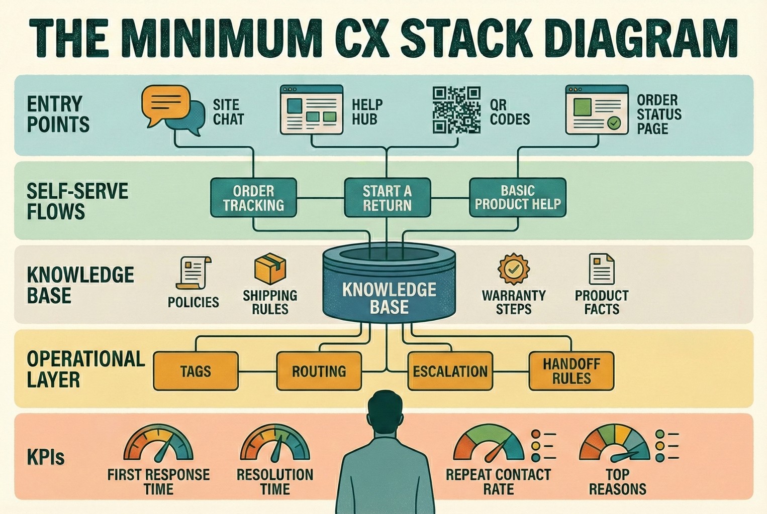
At the top sat the entry points, things like site chat, a help hub, QR codes, and the order status page, basically anywhere a customer might start looking for help.
In the middle were the self-serve flows. Order tracking, starting a return, and basic product help that stopped simple questions turning into conversations.
At the core was the knowledge base. Policies, shipping rules, warranty steps, and product facts that stayed consistent no matter who was replying.
Below that sat the operational layer. Tags, routing, escalation, and handoff rules that kept messages moving without losing context.
Right at the bottom were the KPIs that actually mattered. First response time, resolution time, repeat contact rate, and top reasons coming into support.
Teams often paired this diagram with examples of how QR codes routed customers into the right starting point, especially when support spanned both in-store and post-purchase moments. Laying it alongside the patterns in QR code customer support made the whole thing click much faster. Once this lived on a wall or in a shared doc, decisions got easier. People stopped debating tools and started talking about whether the stack still matched how customers were actually behaving.
2) 30-minute CX platform scorecard
The scorecard worked because it forced honest answers. Not “could this work one day?”, but “does this help us right now, with the team we’ve got?”. Teams usually ran through it together and scored each area from 0 to 2. No debate marathons. First instinct was often the right one.
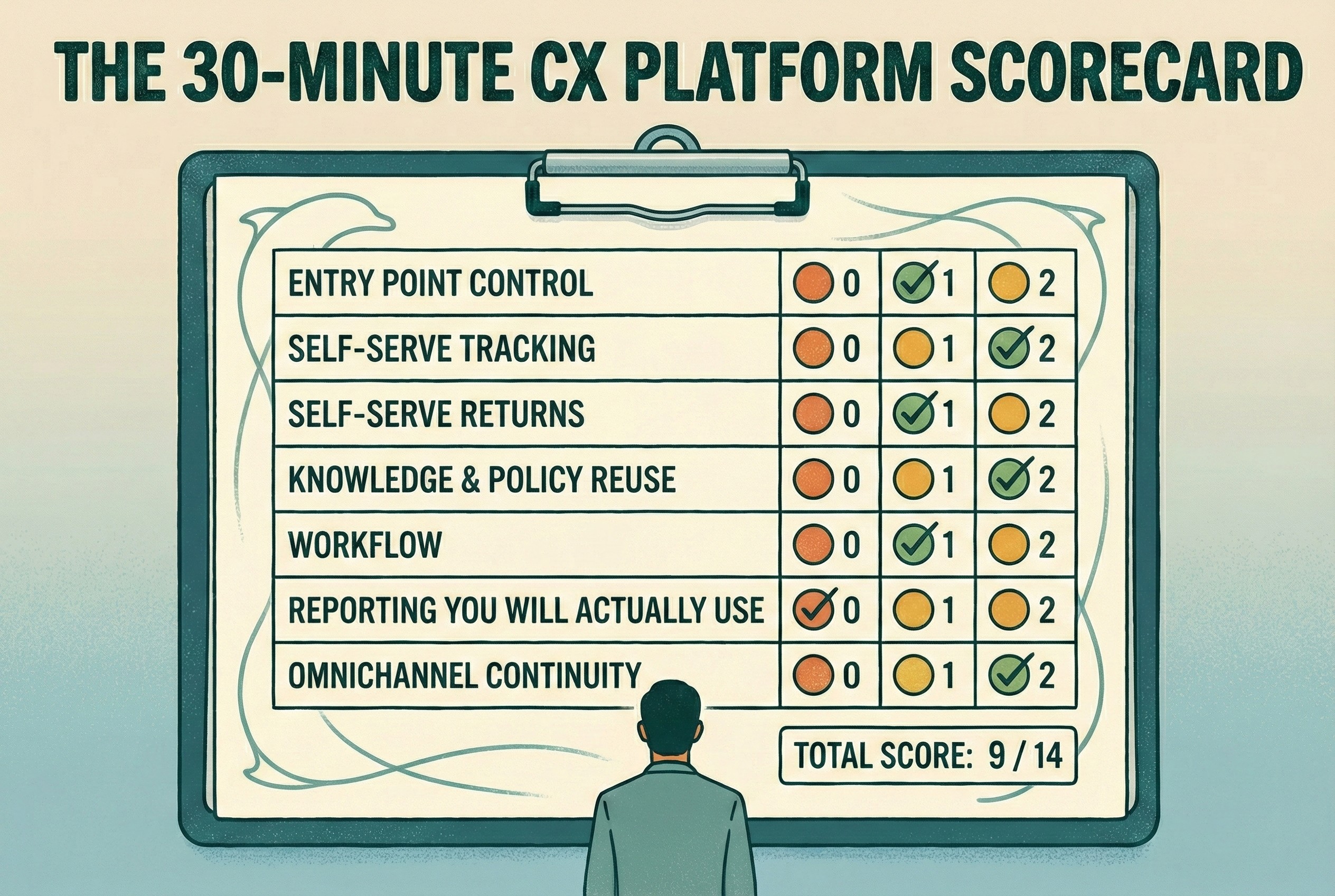
Entry point control
0 / 1 / 2
Can you shape the first screen or menu so customers naturally route themselves, or does everything still land in one big inbox?
Self-serve tracking
0 / 1 / 2
Is order tracking easy to find and genuinely useful, or do customers still ask for updates even though the page technically exists? Clear order status pages were often the difference here.
Self-serve returns
0 / 1 / 2
Can customers start a return without emailing back and forth, or does the process still rely on manual replies? Teams scored higher when a visible self-serve returns flow did most of the heavy lifting.
Knowledge and policy reuse
0 / 1 / 2
Is there one agreed version of shipping, returns, and warranty wording that gets reused everywhere, or does each reply get written from scratch?
Workflow
0 / 1 / 2
Are tags, assignments, internal notes, and handoff rules actually used day to day, or do they only exist in theory?
Reporting you will actually use
0 / 1 / 2
Can someone glance at the numbers and know what needs fixing this week, or does the dashboard just look impressive?
Omnichannel continuity
0 / 1 / 2
Can customers switch devices or channels without starting again, or does context get lost the moment they move? This mattered more than expected once teams realised how normal channel-hopping is in real journeys, and why customers move across channels mid-task.
Total score should be: - / 14
Most teams didn’t need the score to be perfect. They just needed it to be honest. The gaps usually told them more than the total ever did.
3) Help menu labels
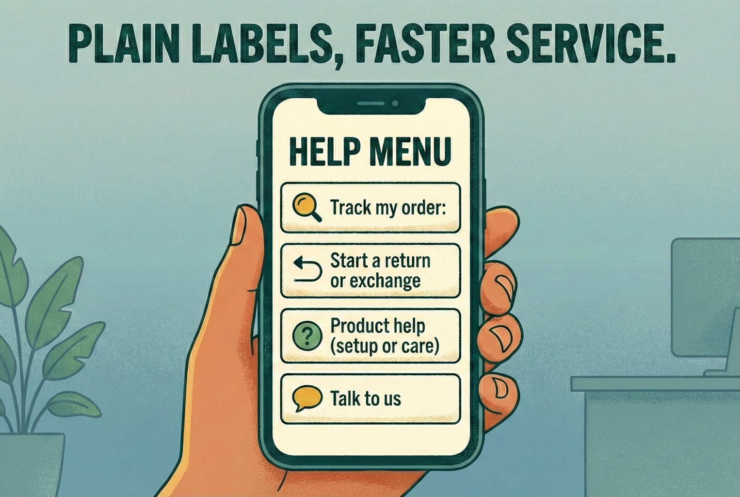
When teams stopped overthinking the wording and just used plain labels, customers moved faster and asked fewer follow-up questions. The first screen usually worked best when it stuck to four options and nothing more.
Track my order
Start a return or exchange
Product help (setup or care)
Talk to us
No clever language. No brand voice experiments. Just labels that said exactly what would happen next. Shops that tried to dress these up with marketing copy almost always rolled it back later. Clarity beats creativity every time.
4) Minimum viable tag set
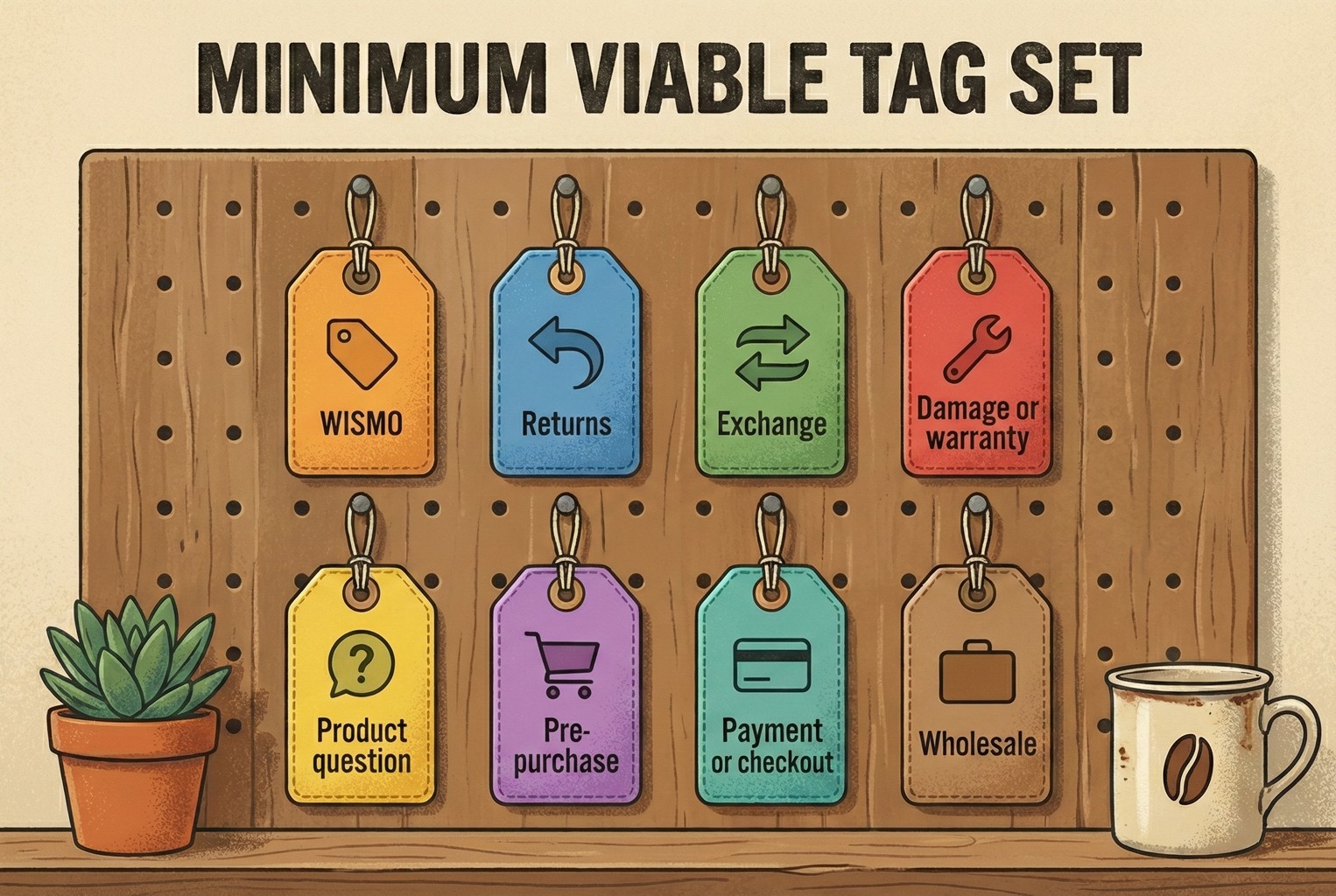
The teams that kept things under control didn’t build huge tag libraries. They picked a small set that covered most conversations and stuck with it long enough to spot patterns. A minimum set that showed up again and again looked like this:
WISMO
Returns
Exchange
Damage or warranty
Product question
Pre-purchase
Payment or checkout
Wholesale
Nothing fancy, and that was the point. With just these tags in place, teams could quickly see what was driving volume, route conversations sensibly, and avoid drowning in over-segmentation. Once the basics were working, a few teams added more detail later. But starting small kept things usable when support got busy.
5) Saved reply skeletons
The replies that worked best weren’t long or polished. They were short, predictable, and easy to reuse without sounding robotic. Teams treated these as starting points, not scripts carved in stone.
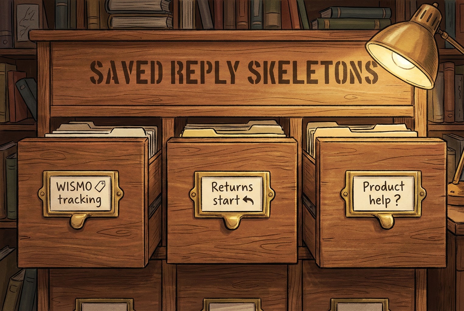
WISMO / tracking
“Hi {name}, quick one. You can track your order here: {tracking_link}.
If it hasn’t moved by {timeframe}, reply with your order number and we’ll take a proper look.”
This stopped most back-and-forth and set expectations without sounding defensive.
Returns start
“Yep, you can start a return here: {returns_link}.
Once we receive the item and check it in, refunds usually take {refund_timeline}.
If anything looks off, just reply with your order number and we’ll sort it.”
Clear next steps, no over-promising, and no room for misreading.
Product help (setup or care)
“Got you. Which product is it, or feel free to share the SKU or name.
Here’s the quick guide: {guide_link}.
If step two doesn’t work, tell me what you’re seeing and we’ll jump in.”
This kept the conversation focused and avoided long explanation threads before the basics were covered.
Teams that wanted to expand beyond these basics didn’t reinvent the wheel. They reused the same structure and tone across more scenarios, often adapting the layouts from returns templates and macros so replies stayed consistent no matter who was on shift. Once these were in place, support replies felt calmer, quicker, and far less improvised.
For the teams who wanted an easier way to run the minimum CX stack without stitching tools together, trying it on a small slice first worked best.
That usually meant starting with AskDolphin Live Chat as the single support entry point, then adding QR code customer support where customers naturally paused, like packaging or in-store signs, so simple questions never had to become conversations.
Most teams tested it on their top 25 questions and watched what happened over a week. If repeat questions dropped and the inbox felt calmer, they kept going. If it didn’t, they scrapped it and moved on. No drama, no hard feelings.
FAQ - The stuff small teams actually worry about
Do I need a full CX platform, or can I just bolt tools together?
You can bolt tools together, and plenty of teams do. The pain usually shows up later. Customers don’t stick to one channel when they’re trying to sort something out. They might start on a QR code, switch to chat, then reply by email without thinking twice. Research into how omnichannel journeys actually work shows that this kind of channel hopping is normal. A platform earns its keep by keeping that journey coherent instead of making customers repeat themselves every time they move.
What should I automate first?
The dull, high-volume stuff that nobody enjoys answering. Order tracking and returns starts nearly always top of the list. When customers can check updates themselves through a clear order status page and kick off a return without emailing back and forth, direct contact drops without harming the experience. It’s boring, but it works.
How much time does this realistically take to set up?
For most small teams, a weekend was enough when the scope stayed tight.
One day to pull together the top 25 questions and lock down policies.
One day to launch a single entry point, add one or two self-serve flows, and agree on basic tags and routing.
After that, teams usually iterated weekly in small steps rather than trying to “finish” everything at once.
What if I only have one person doing support?
That’s usually the strongest case for simplifying, not adding complexity.
The setups that held up best with one person looked like this.
One clear entry point.
Two self-serve links that handled the obvious questions.
One clear escalation rule for money or safety issues.
Four KPIs checked weekly.
That was effectively the platform until the team grew, and for many merchants, it was more than enough.
If you do nothing else this week, nick the scorecard above, sketch out a quick version of the Minimum CX Stack on paper, and take an honest look at how your current setup actually behaves when things get busy. That alone tends to surface more problems than any other tool ever will.
If there are gaps you want to plug next, a few related playbooks tend to help teams think things through without overcomplicating it. Looking at customer experience tools can clarify what’s worth using and what’s just noise. Revisiting customer experience management helps anchor decisions in how experience is run day to day, not just how it’s measured. Mapping out customer touchpoints alongside a simple customer journey map often highlights friction you’ve learned to ignore. And when numbers start creeping in, CX metrics versus CX KPIs keep measurement tied to action rather than vanity. For teams using QR codes in-store or on packaging, QR code customer support fills in the practical gaps.
Bookmark this post, steal whatever’s useful, and keep things simple. The aim isn’t sophisticated systems or perfect dashboards. It’s being sorted, calm, and consistent when customers need help.

About author


